Screen Park Logo
Case Study - UI/UX Design · Figma · Prototyping

Screen
Park.

Timeline 4 Days (11 days from first Figma lesson)
Type Concept / Portfolio Project
Platform iOS · Android · Desktop · Tablet
Tool Figma (first project)
Status Fully Wired Prototype
UX/UI Design Design Systems Component Library Prototyping Dual Variant Themed Entertainment
🎢
A Note on This Project
This is my first project in Figma. I started the Daniel Walter Scott Figma UI/UX Design Essentials course on April 9, 2026. Four days later, Screen Park was a fully wired, dual-variant, symmetrically prototyped app experience with a complete design system, componentized icons, animated interactions, and 41 screens across two brand flows. I'm not listing this to boast. I'm listing it because I want anyone reviewing this work to understand what they're actually looking at - someone who commits fully to learning by doing, and doesn't stop until it's real.
41
Prototype Screens
2
Parallel Brand Flows
14
Pages in Figma File
4
Days to Full Prototype
01

The Problem
Worth Solving.

Theme park apps are built for insiders. Disney and Universal's official apps reward guests who've done weeks of homework, learning which Lightning Lane type applies to which ride, which dining reservation system requires a credit card, what "VQ" means, and which parks require park-to-park tickets for specific lands.

For first-timers and irregular visitors, the actual majority of guests, these apps are anxiety machines. They're designed around the assumption that you already know what you're doing.

Screen Park is built for everyone else.

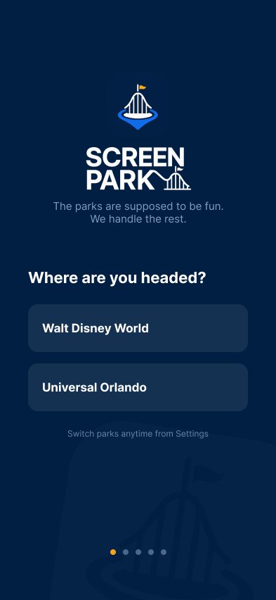
"The parks are supposed to be fun. We handle the rest."

Target User: Families visiting every 1 to 2 years. Overwhelmed by complexity, underwhelmed by what the official apps actually explain. They want a great day, not a certification course.

02

Competitor
Audit.

My Disney Experience (MDE). Powerful but overwhelming. Feature-dense with a learning curve. Terms like "Lightning Lane Multi Pass" vs "Individual Lightning Lane" require explanation Disney doesn't provide in-app. Good for power users. Bad for first-timers.

Universal Official App. Cleaner than MDE but still park-first, not guest-first. Map and wait times are solid. Intel is sparse. No community layer, no insider tips, no "what does this actually mean" explanations.

Ride Ready and third-party apps. Closer to the right idea but cluttered, ad-supported, and designed around data density rather than an actual guest journey.

"Every app I studied was built for the person who already knows. Nobody built for the person who doesn't."

The gap wasn't information. Both official apps have plenty of information. The gap was translation, converting park complexity into a plain-language, guided experience that anyone could pick up and use in the first 60 seconds.

03

Design
System.

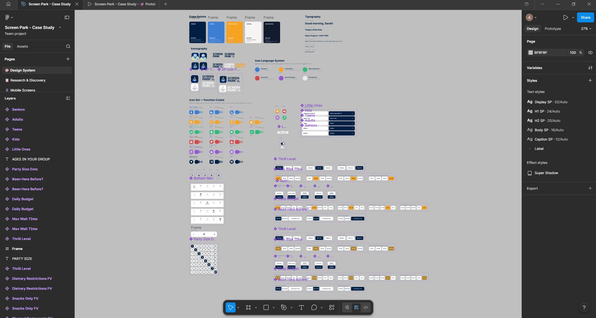
Before a single screen was designed, the design system was built. Color palette, typography scale, icon language, component library, all locked, all documented, all componentized with variants before any screen touched them.

Color Palette
Deep Blue
Accent
Golden Hour
Surface
Charcoal
Color System
5 core colors, all semantic. Primary actions, surface states, function-coded map icons. Consistent across Universal and Disney variants - only hue shifts.
Typography
Plus Jakarta Sans for headings (distinctive, modern), Inter for body and UI. Full scale from Display 32px Bold down to Caption 12px Regular - all with real Screen Park copy examples.
Icon Language
6 function families, color-coded by category rather than by land. Restrooms always blue, food always gold, rides always green. Glanceable at any size, no legend required.
Component Library
Bottom nav with 5 active states. Header component with 4 background variants and toggleable back button, location pill, and subtitle. All componentized, all swappable.
04

The Logo,
In Three Stages.

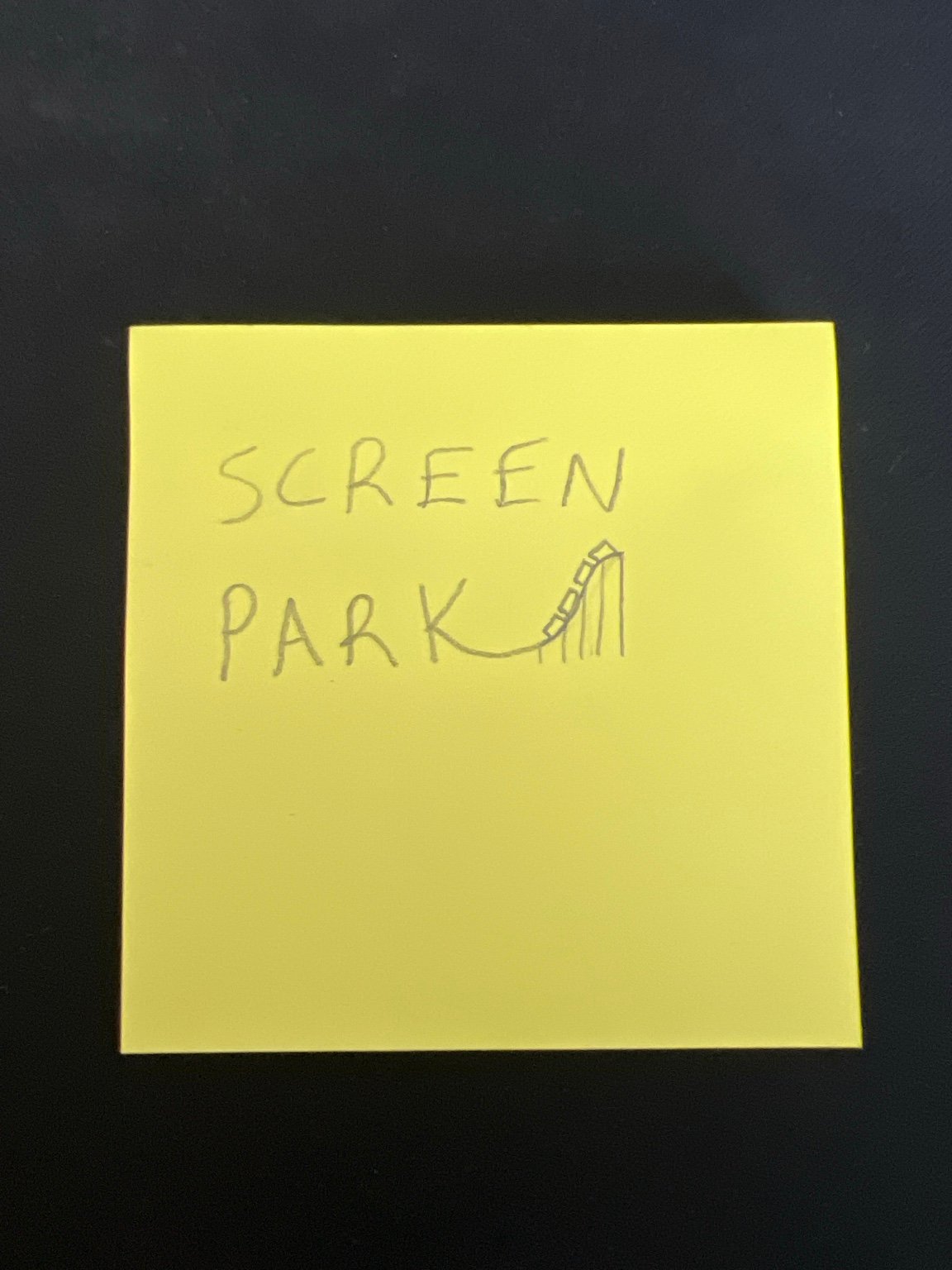
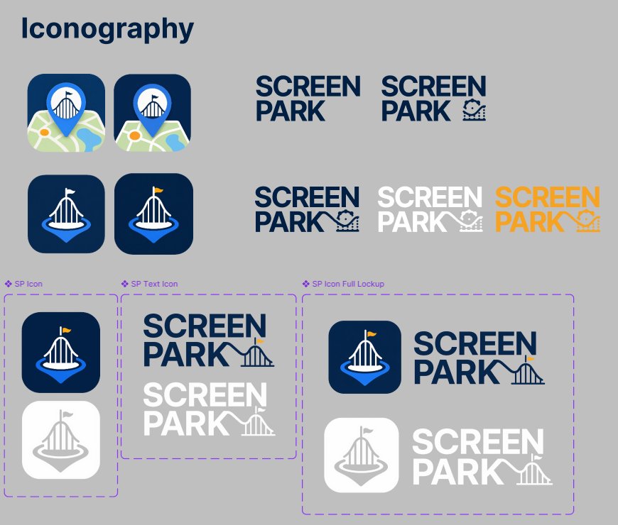
Screen Park needed a mark that could survive being shrunk to a 48 pixel app icon and still communicate the concept instantly. I sketched the first version on a sticky note during the Figma course, imagining a roller coaster crest anchored to a pin. The course covered vector drawing and shape tools around the same time, so I applied those lessons directly to bringing the sketch to life.

Stage 01 - The Sketch
Original Screen Park sticky note sketch
The original napkin sketch. Coaster silhouette, location pin shape, Screen Park wordmark. Drawn during a coffee break while working through the Figma vector drawing lessons.
Stage 02 - Exploration
Iconography explorations and final lockup components
The full iconography page from the design system. Top rows show early concept directions, from the literal "map with pin" approach down to a cleaner pin-anchored coaster crest. The framed components at the bottom show the locked finals: standalone icon, text lockup, and full icon-with-wordmark lockup.
Stage 03 - Final Mark
Final Screen Park icon
Stripped to essentials. Coaster crest, simplified pin below, strong silhouette. Legible at 48px app icon size. Works in dark, light, and color variations. This is the one.
Screen Park full lockup on dark

Final lockup, dark mode variant

05

Four Design
Decisions.

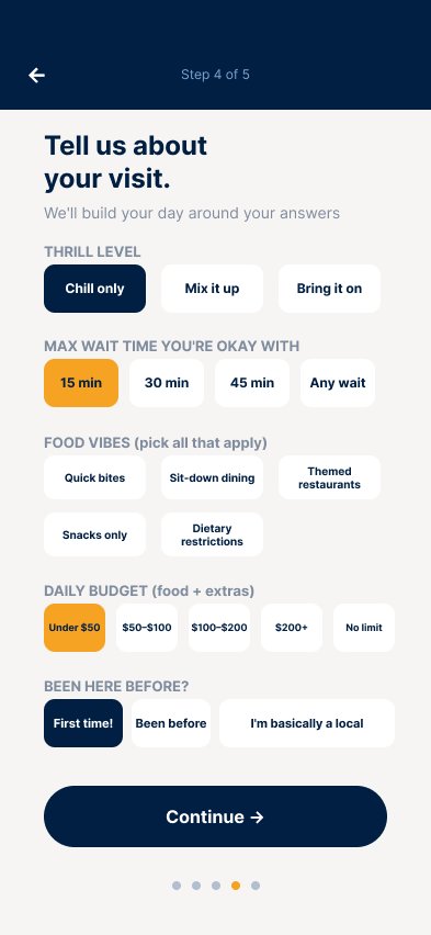
Every major UX decision in Screen Park has a documented rationale. These aren't aesthetic choices - they're answers to real problems observed in competing apps.

01
Function-Coded Icons, Not Land-Coded
The Problem
Disney and Universal both color-code map icons by land - a blue dot in Hogsmeade means nothing until you read the legend. Under pressure, with kids in tow, nobody reads the legend.
The Solution
Screen Park codes by function. Blue is always restrooms. Green is always rides. Gold is always food. You learn the system once and it works across every park, every land, every day.
02
No Jargon, Ever
The Problem
LL, ADR, VQ, Genie+ - Disney's own app uses these acronyms without explanation. First-timers feel excluded before they've even entered the gate.
The Solution
Every feature uses plain language. "Skip Line Pass" not "Lightning Lane." Where an in-park term differs from the app term, a tooltip shows both - so guests are never confused at the actual attraction.
03
The Genie Survey vs. Official Planning
The Problem
Both official apps require understanding their respective planning systems before they'll output a useful schedule. That's homework before a vacation.
The Solution
Screen Park's 8-question Genie Survey collects thrill preference, budget, party ages, must-dos, and max wait tolerance - then outputs a plain-language, drag-reorderable day plan. Two minutes to a full day.
04
The Anti-Gatekeeping Data Model
The Problem
Theme park insider knowledge is hoarded by influencers. The Butterbeer hack, the best photo spots, the hidden menus - all locked behind follows, subscriptions, or knowing the right people.
The Solution
Untappd-style community submissions, editorially verified. Users submit tips, community votes, the app surfaces the best ones. A first-timer gets the same day as a 50-visit regular. Everything is free.
05.5

The Work
In Progress.

This project didn't start with 41 screens. It started with a sticky note sketch, a Figma course that was three days old, and a decision to build something real instead of following along with tutorial files. What follows is the honest version of how ScreenPark came together: the research that shaped it, the architecture that structured it, the iterations that refined it, and one mid-build move that changed how the whole thing was tested.

A — Research & Discovery

The Persona Wasn't Invented. It Was Observed.

Sarah and Luis Lopez aren't a made-up archetype. They're a composite of every family I've watched navigate a theme park — and I've spent a lot of time in those parks. The behavior is consistent: phone out constantly, confused at the map, missing shows they didn't know existed, spending too much on food because they didn't know the hacks, leaving exhausted instead of exhilarated.

The quote that anchored every design decision in this project came from a real conversation:

"I didn't know you had to book dinner 60 days in advance. We ended up eating corn dogs at 4pm because everything was full. Never again."

That's the user. Every screen was filtered through that lens: would Sarah understand this in two seconds, standing in a crowd, with a seven-year-old pulling her sleeve?

Research and Discovery — competitive audit and user persona
RESEARCH & DISCOVERY — Competitive audit mapped across four apps. User persona grounded in observed behavior.
B — Information Architecture

Structure Before Style.

Before a single high-fidelity screen was touched, the full information architecture was mapped. Five tabs, each owning a distinct job. A seven-step onboarding flow designed so that every question fed directly into a useful output. The Genie Survey collects thrill level, max wait tolerance, food preferences, daily budget, party ages, and experience level. That data doesn't just personalize the experience — it builds the entire day plan automatically.

The tab structure decision mattered most. Both official apps use hub-and-spoke navigation with heavy menus. ScreenPark uses a flat five-tab bottom nav because this app gets used one-handed, mid-stride, in loud and crowded environments. Every primary destination needed to be one tap from anywhere. No menus, no drilling, no getting lost.

Information Architecture — onboarding flow and five tab structure
INFORMATION ARCHITECTURE — Seven-step onboarding, five-tab structure, and signature features mapped before any high-fidelity work began.
C — A Key Design Distinction

Land-Coded vs. Function-Coded.

Most park apps color-code their maps by land. The logic makes sense at the macro level — you can orient yourself across the whole park at a glance. But land-coded color only helps when you're trying to figure out where you are relative to the entire park.

The problem is that's not the most common navigation need. Most of the time, guests are already inside a land and need something specific right now. A bathroom. A food cart. A photo op. At that point, a land-coded map tells you nothing useful because everything around you is the same color.

ScreenPark codes by function instead. You learn the system once and it works in every land, in every park, on every visit. Your seven-year-old can find the bathroom in two seconds without reading a legend.

Official Apps
Land-Coded Color

Useful for macro orientation across the whole park. Stops being useful the moment you're already inside a land and need something specific right now.

ScreenPark
Function-Coded Color

Learn it once, works everywhere. Every land, every park, every visit.

Restrooms Food Rides Photos Merch
D — Mid-Build Field Test

Closed the File. Went to the Parks.

Midway through building the Universal flow — before the Disney variant was started and before the prototype was wired — the file got closed and a day was spent at the actual parks. Not as a guest. As a researcher.

Families weren't consulting the map at ride entrances, they were consulting it in the middle of walkways, stopped in foot traffic. The moments of confusion weren't about features — they were about orientation: where am I, what's near me, what should I do next. The phone came out most at decision points, not at attractions.

That observation directly influenced the Near Me feature in the Park tab, the Land Intel card behavior in Discover, and most significantly, the Closing Hour Ritual.

Closing Hour Ritual screen
The Closing Hour Ritual

End the day right.

The ritual came from watching families at park close with no exit strategy. They'd been reactive all day and were now standing in a parking lot figuring out what just happened.

One hour left. One last ride based on live waits. Best spot to watch the lights come on. Final snack near the exit. How to beat the parking crush. A designed ending — something no official app has.

"Don't worry, we got this" is the entire philosophy of ScreenPark in four words.

⏱ Time-triggered — lives outside the prototype flow by design
E — What Changed in Iteration

Three Before-and-Afters.

Three specific components went through documented rounds of iteration. Each one has a clear problem, a clear decision, and a clear reason.

Iteration 01
Edit Mode — Tag Placement

The first version had category tags on the left side of each list item, ahead of the activity name. In testing the drag interaction, left-leading tags created visual noise at exactly the point where the eye needed to track reordering. Tags moved to right-trailing position. The left edge became clean, the drag handle sat flush, and the list became readable in motion.

Edit mode before and after — tag placement
LEFT: Tags leading left — creates noise during drag. RIGHT: Tags trailing right — clean edge, readable in motion.
Iteration 02
Me Settings — Clarity and Priority

Three changes in one pass. "Absolute No-Gos" simplified to "No-Gos" — cleaner, less intimidating. Arrival Time added as a standalone field because the day plan was generating time-stamped slots with no anchor. Most significantly, Switch Park or Resort promoted from a buried settings row to a full-width primary CTA — multi-park ticket holders switching mid-day is common, it happens under time pressure, and it triggers a full replan. Burying it was the wrong call.

Settings screen before and after
LEFT: Original settings. RIGHT: No-Gos simplified, Arrival Time added, Switch Park promoted to primary CTA.
Iteration 03
Icon Set — Three Rounds to Final

The icon system went through three documented rounds. The first pass established the function-color logic and rough geometry. The second resolved shapes at 48px and confirmed legibility across all six categories in context. The third locked the final set: fully geometric, consistent stroke weight, readable at small sizes without labels. The function-coded language is what makes the map work at a glance — getting the icons right at small sizes is what makes the language trustworthy.

Icon set — function coded final version
FINAL ICON SET — Six function families, each color-coded, each geometric, each legible at 48px without a label.
F — Domain Knowledge as Design Input

The Decision That Came From Knowing the Space.

The Secrets tab inside Discover exists because of a specific frustration with how theme park knowledge gets distributed. The Butterbeer foam hack, the single rider line on Hagrid's that cuts 90 minutes to 20, the child swap program most parents with young kids have never heard of — these live on YouTube channels and Instagram accounts that require following, subscribing, and already knowing where to look.

That's a class system. The people who know get better days. The people who don't, don't.

The Untappd-style community model was the answer: users submit tips, the community votes, an editorial layer verifies. Nothing is locked behind a follow. A first-timer gets the same information as someone who's been fifty times. That's the entire philosophy of ScreenPark expressed as a single feature.

06

App
Structure.

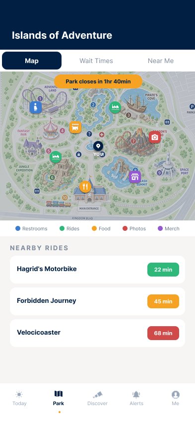
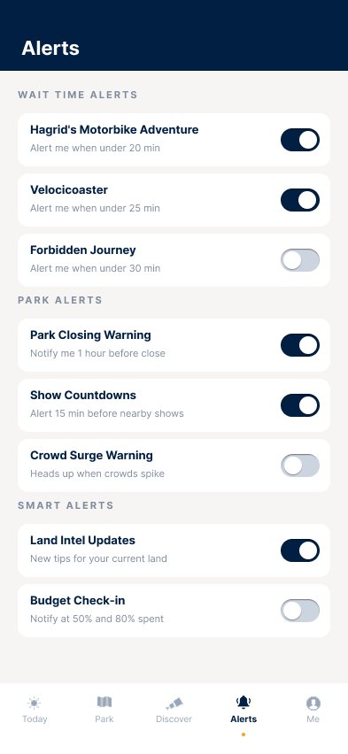
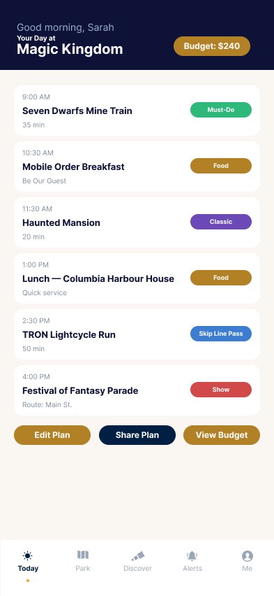
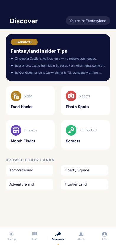
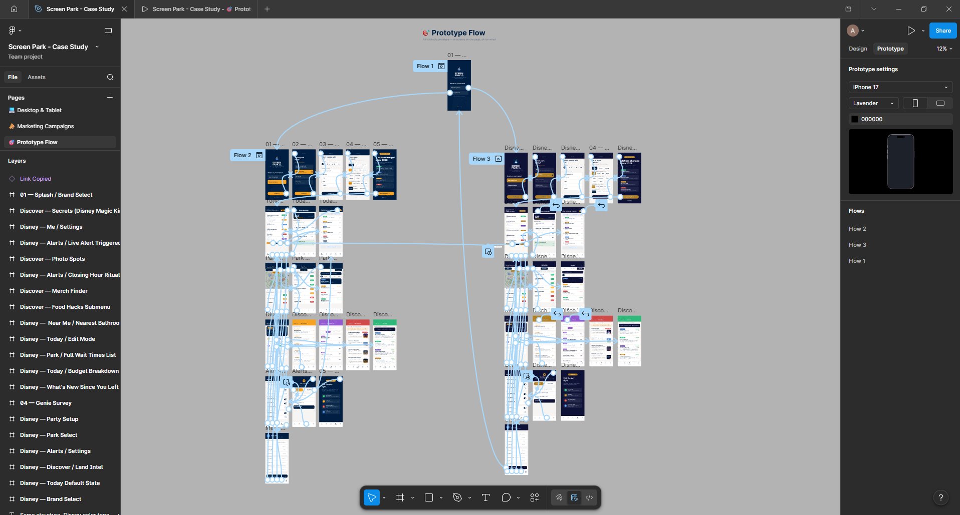
Five tabs. Each one a distinct, complete experience. The architecture is designed so guests can navigate entirely by context - where they are, what they need, when they need it.

Today tab icon
Today
Genie Planner. Day schedule, drag to reorder, budget tracker, closing hour ritual.
Park tab icon
Park
Live map, live wait times with alerts, nearest restroom, food, or photo via geolocation.
Discover tab icon
Discover
Land Intel. Food Hacks, Photo Spots, Merch Finder, Secrets, all community-sourced.
Alerts tab icon
Alerts
Custom wait time alerts. Animated toggles. Live push notification when a ride drops.
Me tab icon
Me
Party settings, preferences, budget, Switch Park, fixed above the nav for accessibility.
07

Dual Brand
Variant.

Screen Park is designed as a multi-resort platform. The Universal Orlando and Walt Disney World variants share identical information architecture, navigation logic, and interaction patterns. Only the color language and content adapt.

This symmetry is the point. Once a guest learns a feature in one park, they own it everywhere. That shared muscle memory matters most when it counts, heads down in thick crowds, kids tugging on a sleeve, two minutes to decide the next move. Confident navigation translates directly into faster decisions, fewer missed reservations, and more time actually in the experience.

Universal
Orlando
Deep Immersive Blue primary, Electric Horizon accent, Golden Hour contrast. Content references Islands of Adventure, Epic Universe, and the Wizarding World. The full-coverage variant - all 5 tabs, all submenus, fully wired prototype.
Walt Disney
World
Midnight Blue primary, Magic Purple accent, Disney Gold contrast. Content references Magic Kingdom, Fantasyland, and Tomorrowland. 21 screens across all tabs - a complete parallel system demonstrating the variant approach.
08

Interactive
Prototype.

Full wired prototype - Splash → Onboarding → Today → Park → Discover → Alerts → Me. Animated toggles, interactive survey states, horizontal scroll, share plan flow, and parallel Disney variant. Embed below or open in Figma.

Open Prototype in Figma → Universal + Disney flows available

Tap through the full Universal and Disney flows above. Or open in Figma for the full 41-screen prototype.

09

11 Days Learning.
4 Days Building.

Started the Figma course April 9. Cert in hand April 14. True prototype build started April 17. Four days later this existed. The eleven days matter because they show the ramp -- the four days matter because they show what happens when the ramp is done.

April 9 - April 14
Figma Course. Cert in 5 days.
Started the Daniel Walter Scott Figma UI/UX Design Essentials course on Udemy. Used the course as the runway for something real instead of just following along, building a rough pre-alpha of Screen Park lesson by lesson so every technique had a live creative context to land in. No time wasted. Every lesson applied the same day to a case study I wanted to exist. Completion certificate issued April 14. Credential ID: UC-5bbacdd2-adf1-4e2a-b7fd-bc98f68a4a9c.
Days 1–2
Design System Built First.
Color palette, typography scale, icon language system locked before any screens touched. Componentized the bottom nav with 5 active state variants. Built the header component with 4 background color variants and toggleable elements.
Days 3–5
Onboarding + Core Screens.
6-screen onboarding flow. All 5 tab screens. Budget Breakdown, Edit Mode, Park subviews. Standardized all headers to 100h with consistent formatting across the file.
Days 6–8
Submenus, Variants, Disney Build.
Food Hacks, Photo Spots, Merch Finder, Secrets submenus across both parks. Disney variant built - 21 screens mirroring the Universal flow in the Magic Kingdom color language. Custom logo designed. Icon set finalized and componentized.
Days 9–11
Prototype. Animation. Polish.
Full prototype wiring - 41 screens, parallel Universal and Disney flows. Animated alert toggles, share plan flag animation, interactive Genie Survey states with mutual exclusivity, horizontal scroll on filter bars, party size stepper with dot variants. Parks trip mid-build to test the real UX against the design. Came back and applied what was missing.
10

Selected
Screens.

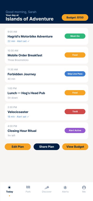
A selection of screens from the Universal and Disney flows. Each screen was designed to component spec and updated with the final icon and nav component library.

Screen Park Splash and Brand Select
Splash / Brand Select
Universal or Disney, the fork in the road
Genie Survey interactive states
Genie Survey
8 questions, 2 minutes, a full day plan
Today day plan with budget
Today / Genie Planner
Day plan, drag to reorder, budget aware
Islands of Adventure live map
Park / Map and Wait Times
Function-coded icons, live waits, Near Me
Discover Land Intel
Discover / Land Intel
Food Hacks, Photos, Merch, Secrets
Food Hacks submenu
Food Hacks
Community-sourced, editorially verified
Photo Spots with golden hour active
Photo Spots
Scene previews, time-of-day tips
Alerts settings with animated toggles
Alerts
Wait time, park closing, show countdowns
Disney variant Today screen
Disney Variant / Today
Same UX, Disney color language
Disney variant Discover screen
Disney Variant / Discover
Fantasyland intel, parallel feature set
Screen Park design system overview
Design System
Colors, type, icons, components, all componentized with variants
Full prototype flow layout in Figma
Prototype Flow / Wiring
41 screens, Universal left, Disney right, mirrored 1:1
11

What I
Learned.

This project taught me more about design systems than any tutorial could. The constraint of building a second variant (Disney) after completing the first (Universal) forced every decision I made in the design system to be defensible. If a component couldn't adapt to a different color language while keeping the same structure, it wasn't actually a system - it was a one-off.

I went to Universal's parks mid-build specifically to stress-test the UX assumptions in the app against real guest behavior. Watching how actual families navigate the parks - the moments of confusion, the missed turns, the time spent looking at phones instead of the experience - confirmed every design decision I'd made and surfaced a few I hadn't thought of.

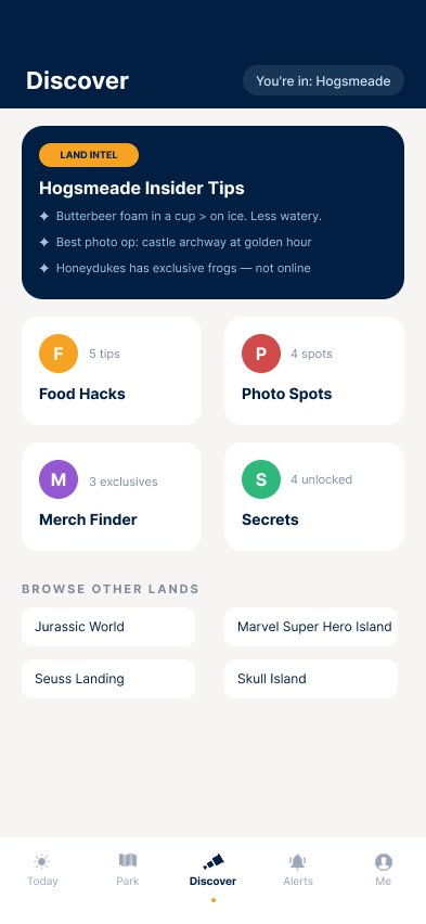
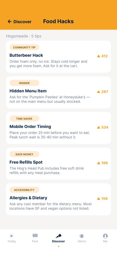
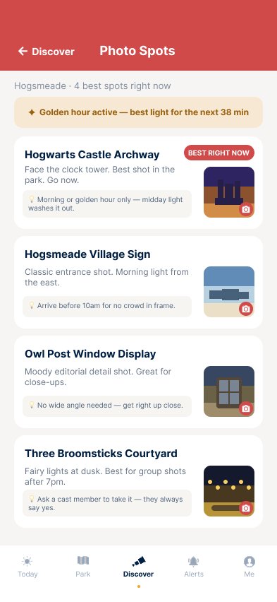
The anti-gatekeeping model is the one I'm most proud of. Theme park expertise shouldn't be a class system. The Butterbeer foam hack, the best photo spot at golden hour, the single rider line on Hagrid's that nobody advertises, the child swap program that lets parents with young kids take turns on thrill rides without re-queueing, these are the things that make the difference between a stressful day and a great one. Screen Park exists to equalize that.

For seven years at SOPO I designed in Adobe XD, the tool the company paid for and standardized on. When our developers recommended moving to Figma, I advocated for the switch. Leadership chose to stay on XD, so I kept shipping on XD, biweekly updates across five platforms for 25+ full redesigns. The work speaks for itself.

The industry, understandably, has moved on. Figma is the current standard, and matching the standard is table stakes. So I closed the gap. Eleven days to get fluent, four days to build something that shows what I can do with it. Screen Park isn't my proof that I can design, my portfolio already does that. It's my proof that when the tooling shifts, I shift with it fast, and I raise the bar on myself in the process.

Next Case Study

SOPO-
Console UI for a Poker App.