SOPO.
Poker App UI.
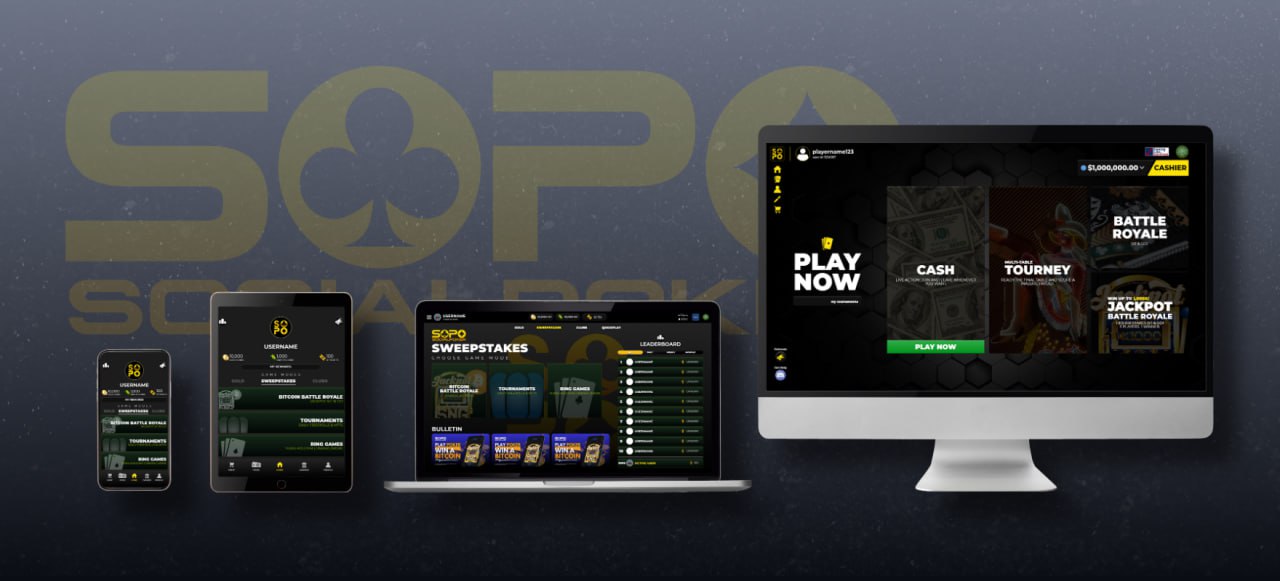
For seven years I was the sole UI/UX designer at SOPO, the first and still only mobile poker app on the App Store to offer real-money-value play through sweepstakes gaming law. What started as a basic mobile app evolved through 25+ major redesigns into a cross-platform experience spanning five platforms: iOS, Android, web, desktop, and the Solana Seeker mobile device.
I owned every pixel across both SOPO (the U.S. sweepstakes product) and SOPO Pro (the international crypto-wallet product), from research and wireframes through high-fidelity mockups, interaction design, motion graphics, and developer handoff. I shipped on a biweekly cycle driven by community feedback and internal testing.
I introduced a gaming-inspired aesthetic drawn from Call of Duty, Fortnite, and Destiny, built complete gamification systems, and created loading animations that turned a technical pain point into a moment of delight. The app reached a 4.8-star App Store rating and 67,000+ registered users.
THE STARTING
LINE.
When I joined, the app looked and felt like a prototype. The design needed to work across five completely different contexts and audiences , from solo mobile play to bar tablets to blockchain hardware.
- Generic poker UI with no visual identity in a market full of established competitors
- Inconsistent experience across devices , mobile, tablet, and desktop felt like different apps
- Screen freezes during hand loading created the perception of crashes, causing user churn
- No gamification or engagement hooks beyond the core poker game
- No design system , no component library, no shared visual language
- Five very different contexts: personal mobile, bar tablets, desktop power users, blockchain hardware, and an international crypto product
THREE DESIGN
Eras.
Seven years of iteration organized into three distinct phases, each building on the last.
Established a cohesive visual language: color system, typography scale, and a reusable component library. Focused on making the core poker experience intuitive , chip stacks, card animations, table layout , and ensuring responsiveness even on slower devices.
This pass was about building trust through consistency. Every screen, every state, every edge case accounted for and resolved before moving forward.
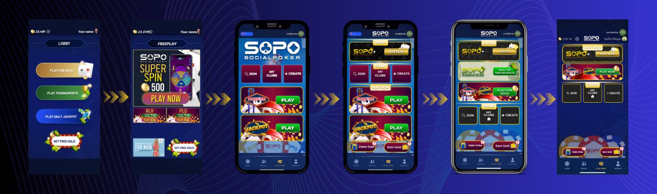
Not being a poker player turned out to be an advantage. Instead of designing for purists, I studied what made digital card games like MTG Arena and Gwent irresistible to a gaming-native audience, then brought that energy to poker.
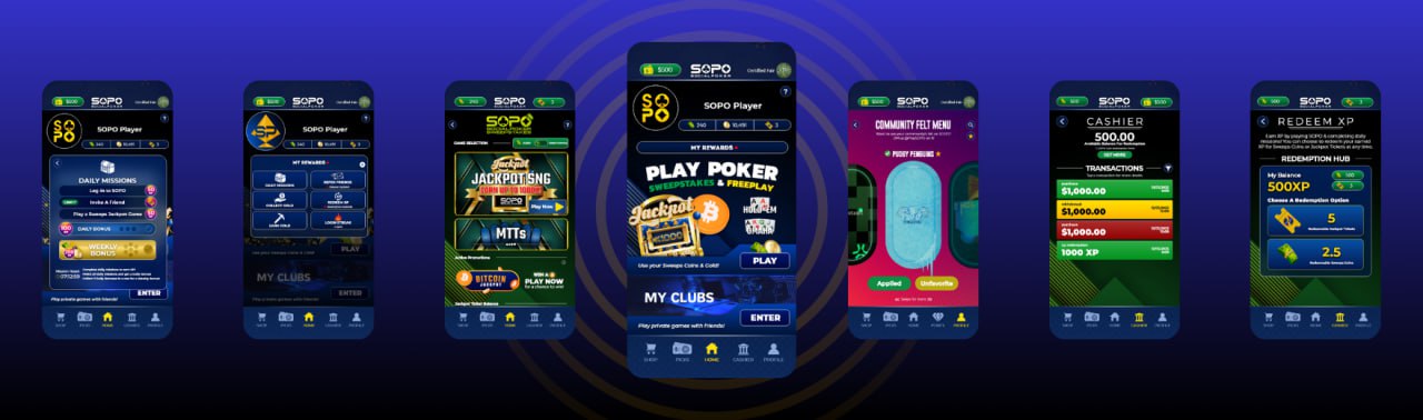
- Daily missions refreshing every 24 hours
- XP progression with visible level-up rewards
- Login streaks with escalating incentives
- Weekly and all-time leaderboards
- Loading animation that eliminated the perception of screen freezes entirely
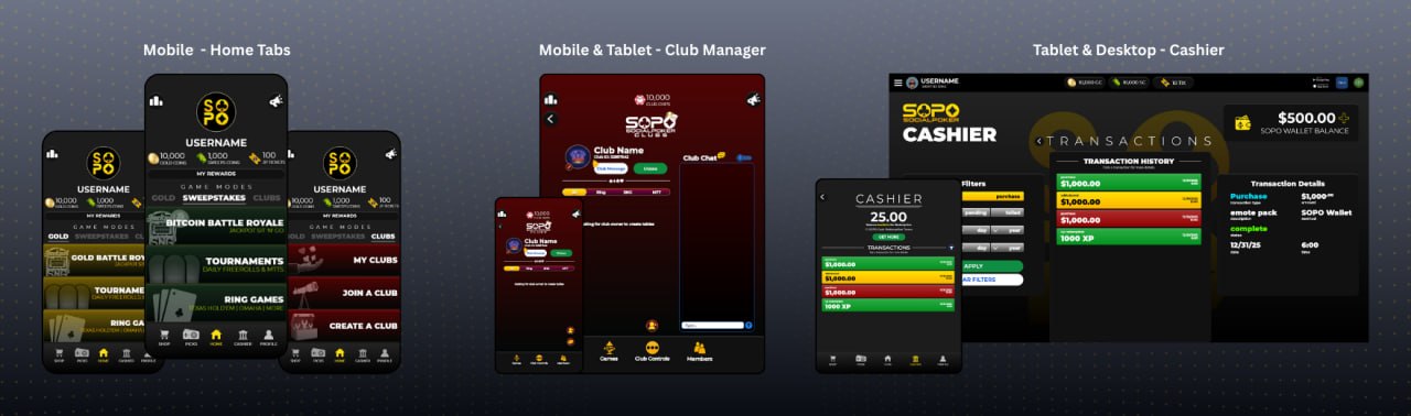
Optimized for cross-platform consistency while respecting each device's unique strengths. Built device-specific UX strategies instead of forcing one layout everywhere.
- Mobile: touch-first, large tap targets, swipe gestures, one-handed play
- Tablet: landscape-first, split-screen live play and viewing
- Desktop: command-center layout, multi-table, keyboard shortcuts
- Solana Seeker: blockchain-native with crypto wallet integration
- Bar/restaurant: co-branded simplified UI with venue theming
Pass 1 , Foundation. Establishing the visual language, component library, and core poker UX (2019–2020)
Pass 2 , Dopamine Rush. Gamification layer, daily missions, XP system, and the loading animation that solved screen freezes (2020–2023)
Pass 3 , Cross-Platform. Device-specific UX strategies across mobile, tablet, desktop, and Solana Seeker (2023–2025)
DESIGN IN
Motion.
Before SOPO, I produced electronic music and performed as a DJ. When the app needed sound design, I sourced, layered, and mixed every sound effect in these animations, applying the same ear for impact and timing I developed in music production.
The loading animation solved a real engineering problem , screen freezes during hand loading were being perceived as crashes. The "doors closing and opening" transition masked the network latency entirely, turning a pain point into a signature moment.
Turn on sound using the speaker icon on each video.
SEVEN YEARS.
The Numbers.
Every major redesign moved the needle. Here's the cumulative impact of 25+ iterations.
Three structured beta tests validated each major design evolution and gave us the data to iterate with confidence.
WHAT SEVEN
Years Taught Me.
NEXT PROJECT.
Screen Park , UX/UI concept for the modern theme park guest.