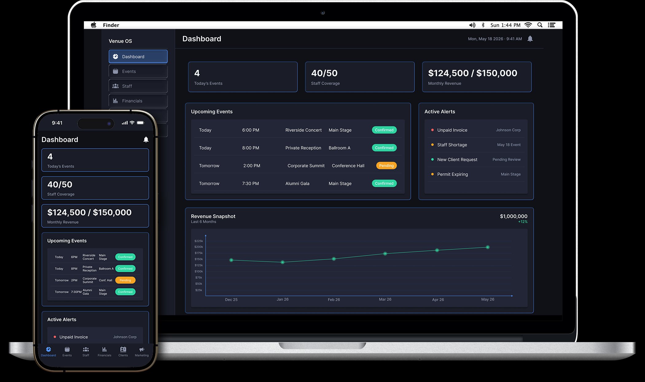
Here is the honest starting point: I didn't know products like this were a design discipline at all. I figured a venue just bought whatever operations software existed off a shelf and lived with it. Job searching corrected me. This is a real and competitive product space, companies build and sell these operations tools, they iterate on them, and they hire UX designers to do it. What I also found is that the shelf is crowded at the extremes and empty in the middle. So I went looking at what the existing tools actually get right and wrong, and designed for the venue they all overlook.
Mid-size live event venues (2,000 to 10,000 capacity) operate at the intersection of hospitality, logistics, and finance, but the tools they rely on were not built for that complexity. A typical venue operations manager juggles event booking software, a separate staffing tool, spreadsheets for financials, email threads for client communication, and a shared calendar that nobody fully trusts. None of these talk to each other.
The result is a daily coordination tax: information that should be automatic has to be manually reconciled. A change to an event date means updating five places. A staffing conflict surfaces the morning of a show. A client asks for a budget summary and the answer lives across three spreadsheets and two inboxes.
Enterprise solutions exist, but they are built for arenas and stadium operators with full IT departments and six-figure implementation budgets. Mid-size venues are left choosing between tools too simple to cover their real complexity, or platforms too expensive and bloated to justify.
"Venue OS is a unified operations dashboard designed for the venue ops manager at a mid-size venue, one interface that connects event scheduling, staff management, financials, and client relationships so that running the building does not require running five apps at once."
The point of this section is not to make you read my research. It is to show you it happened. Before a single wireframe: two personas, a competitive audit of the four most relevant tools in the category, five pain point clusters each tied to a How Might We, and a Jobs To Be Done framework for both users.
EventPro. Modular approach sounds flexible. In practice, each module solves its own problem in isolation. The dashboard tells you what is booked, not what is happening. Best for small hospitality venues. The gap it leaves: reduces data entry without reducing cognitive work.
Artifax. Purpose-built for performing arts and cultural venues. Deep scheduling logic, strong financial integration. The sector-specific assumptions baked into the UX do not map cleanly to a mixed-calendar mid-size amphitheater. Users report feeling like they are using about 25% of it. The gap it leaves: power users get a lot out of it. Everyone else is lost.
Momentus Technologies. The category leader. Comprehensive, enterprise-grade, trusted by 700+ venues. It also assumes enterprise resources: custom pricing, implementation measured in months, and a UI carrying 30 years of feature accumulation. The gap it leaves: the right answer for a stadium, the wrong answer for Amy.
Spreadsheets and Google Calendar. The default non-solution. Frictionless to start, infinitely flexible short-term. Most venues have six of them, maintained by different people, none in sync. The cost is invisible on a balance sheet and visible everywhere else. The gap it leaves: everything. This is the gap Venue OS fills.
The pattern across all four: every option either oversimplifies until it stops reducing real work, or overbuilds until only a stadium can afford and staff it. Nothing in the category is designed for the mid-size venue on its own terms.
The research resolved into three core jobs the product had to do, stated the way the users would state them:
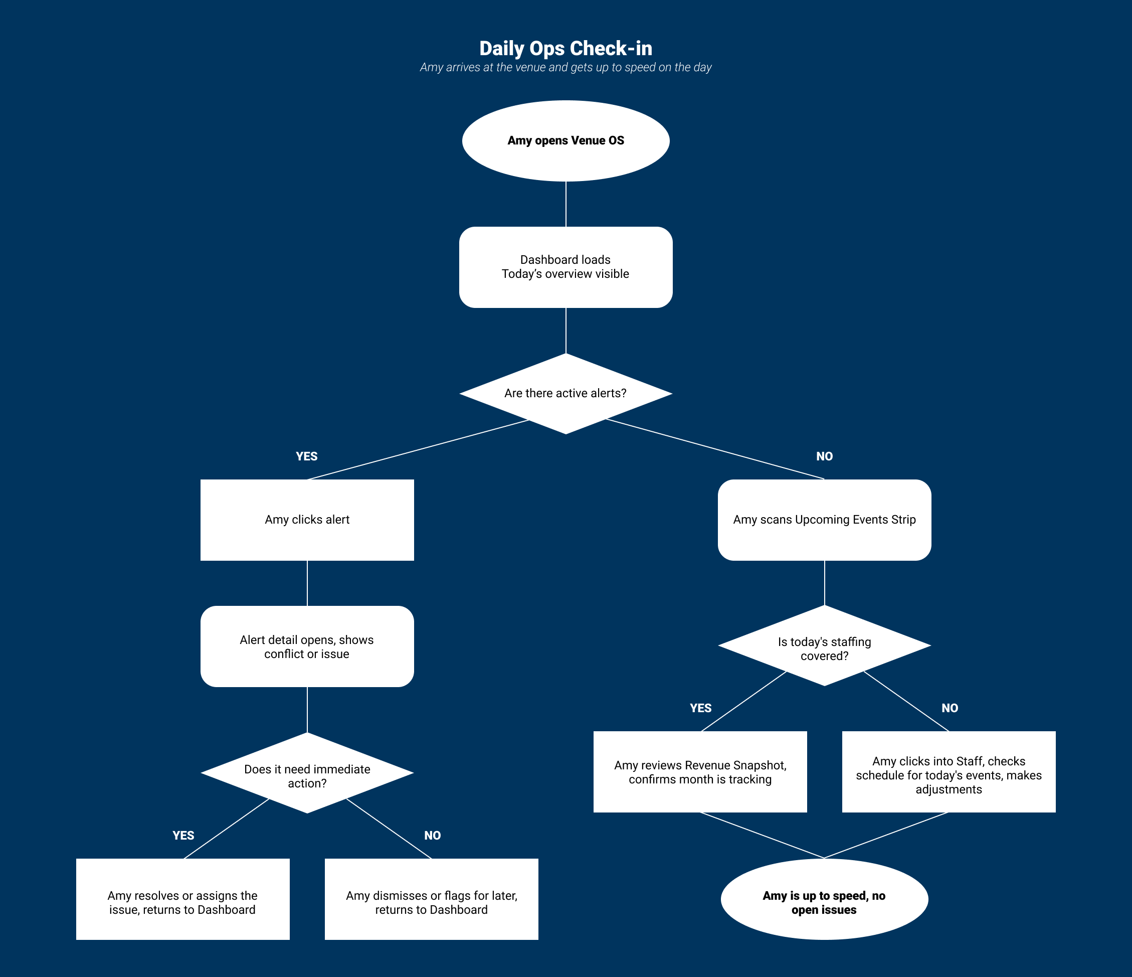
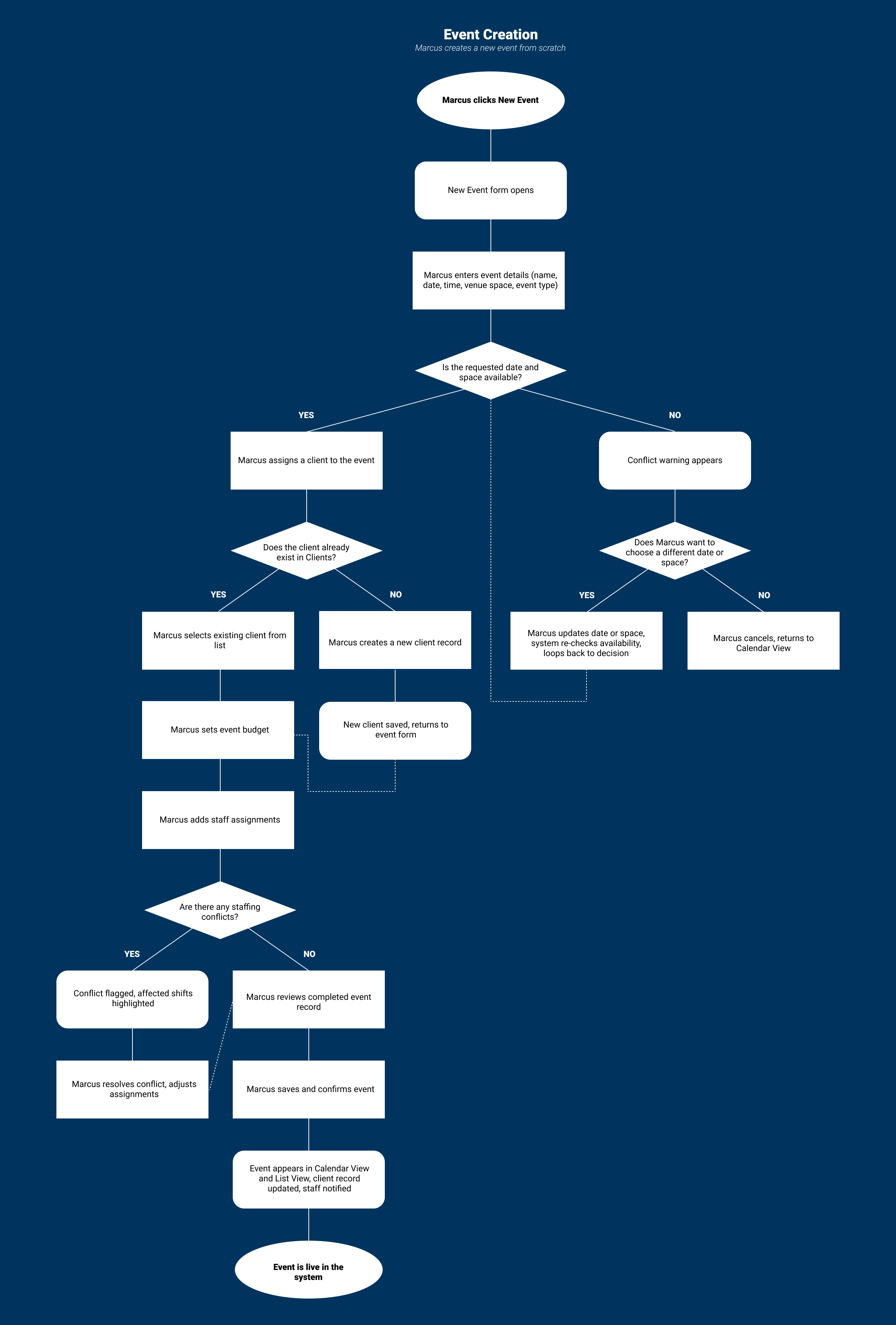
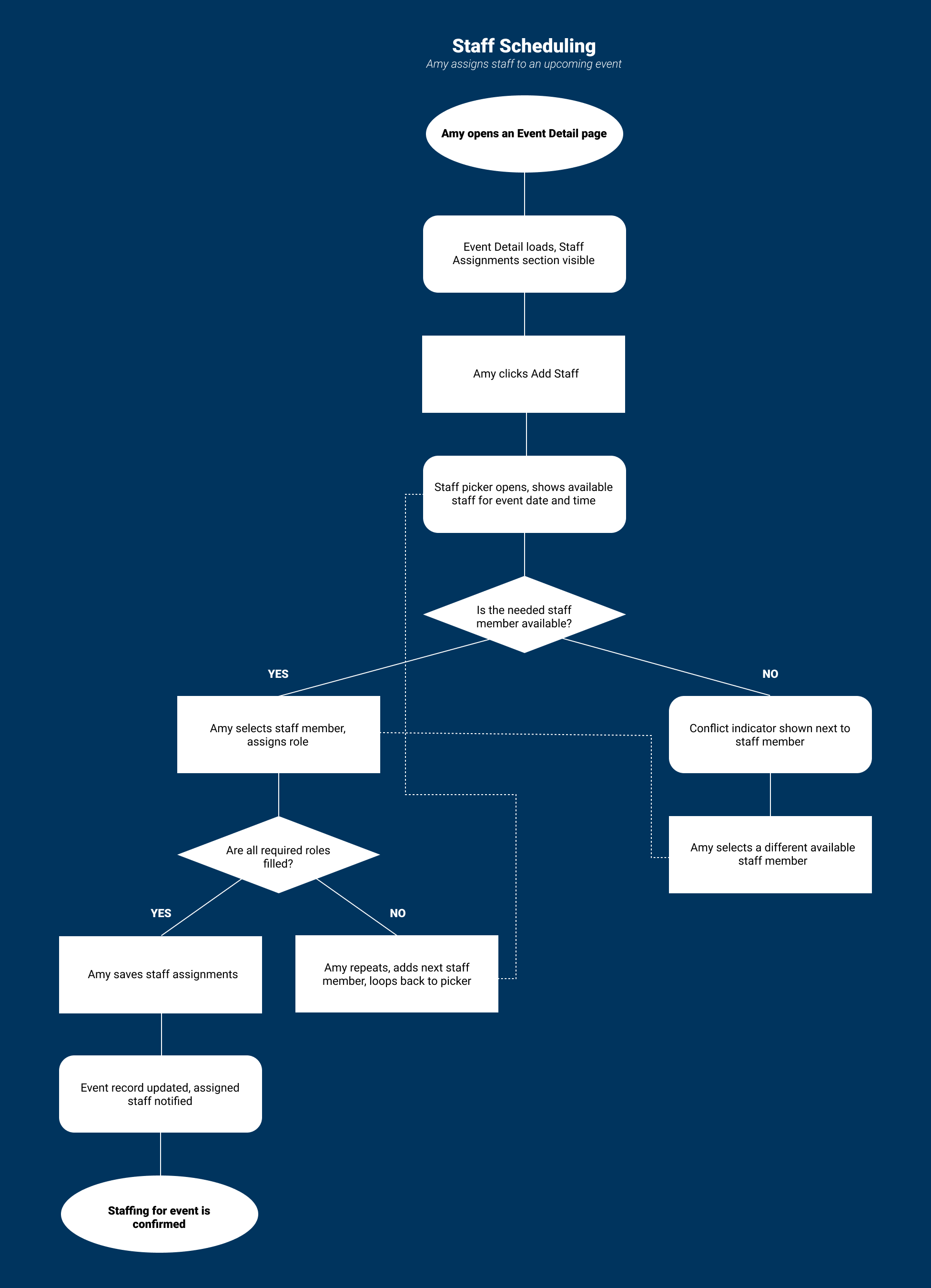
This is the part of the project I care about most, because it is the part that proves what I actually set out to prove. Between jobs, I put myself through formal UX coursework, the Garrett five-planes model, information architecture, navigation design, the discipline of building a product from strategy up through structure before you ever touch a surface. Venue OS is where I applied that end to end, on my own, to see whether the framework had become instinct. It had. The six top-level sections are organized by function rather than role or time, because that matches how Amy actually thinks under pressure. Dashboard as home base. Events, Staff, Financials, Clients, and Marketing as the operational domains. Three user flows documented: daily ops check-in, event creation, and staff scheduling.

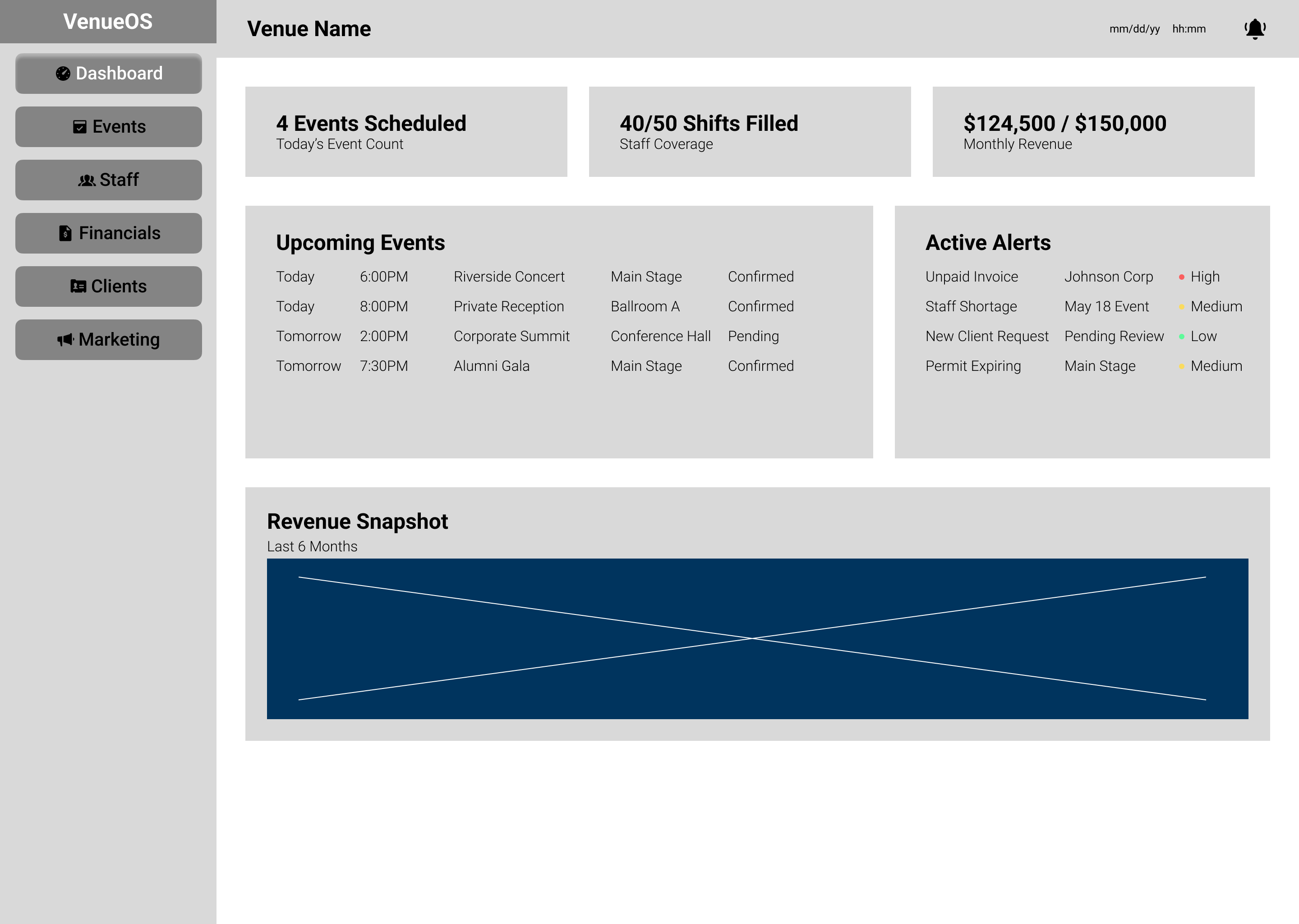
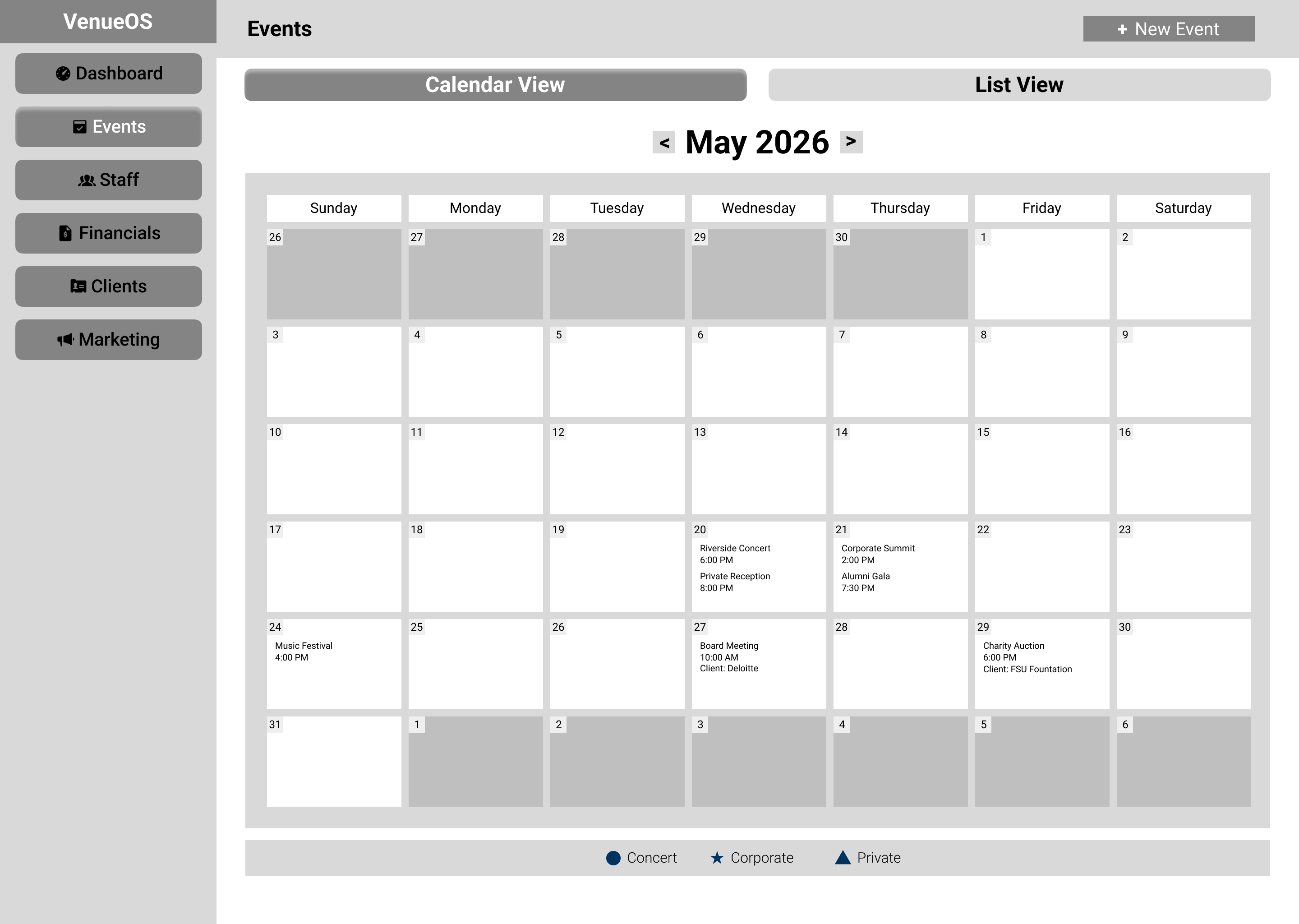
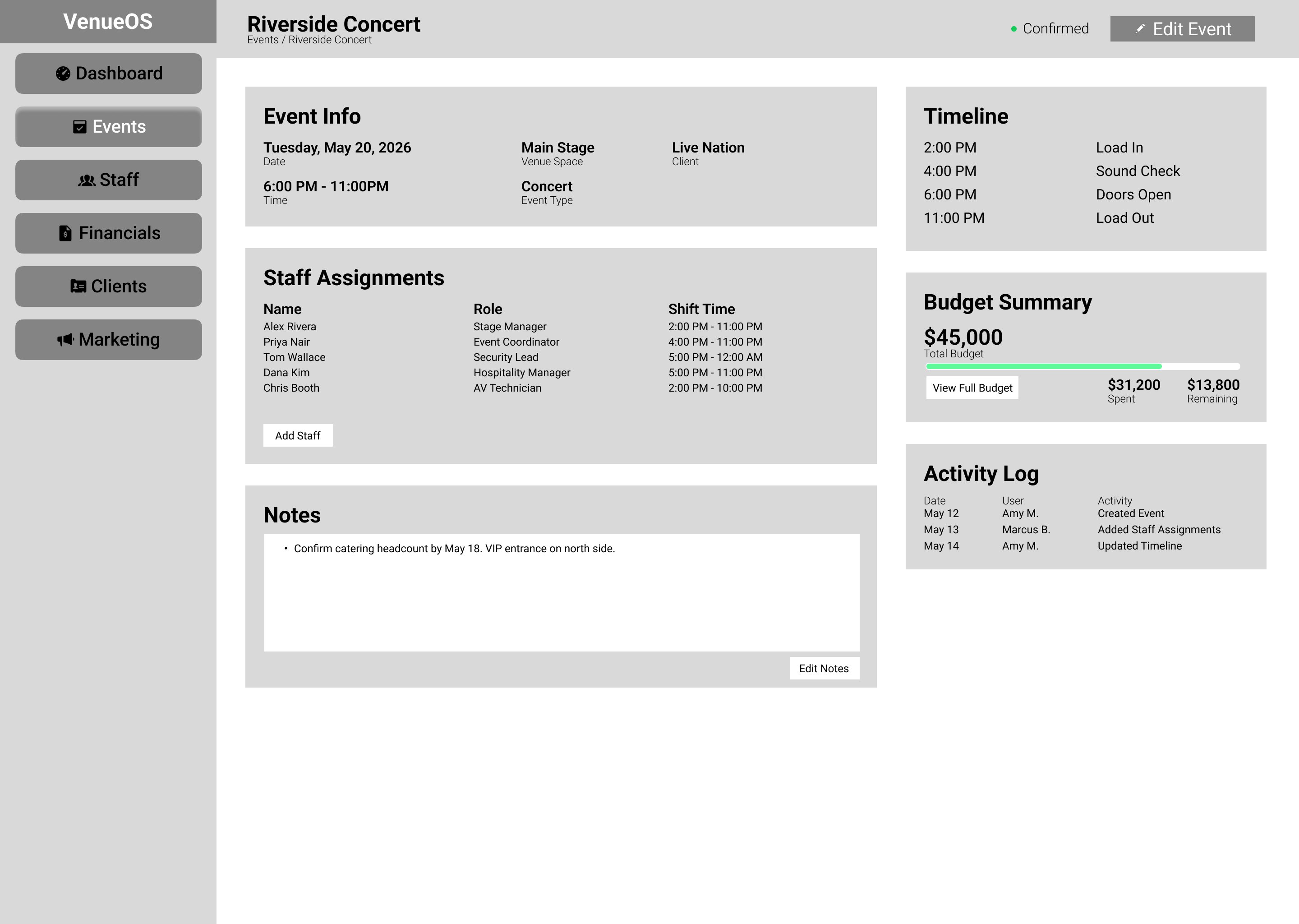
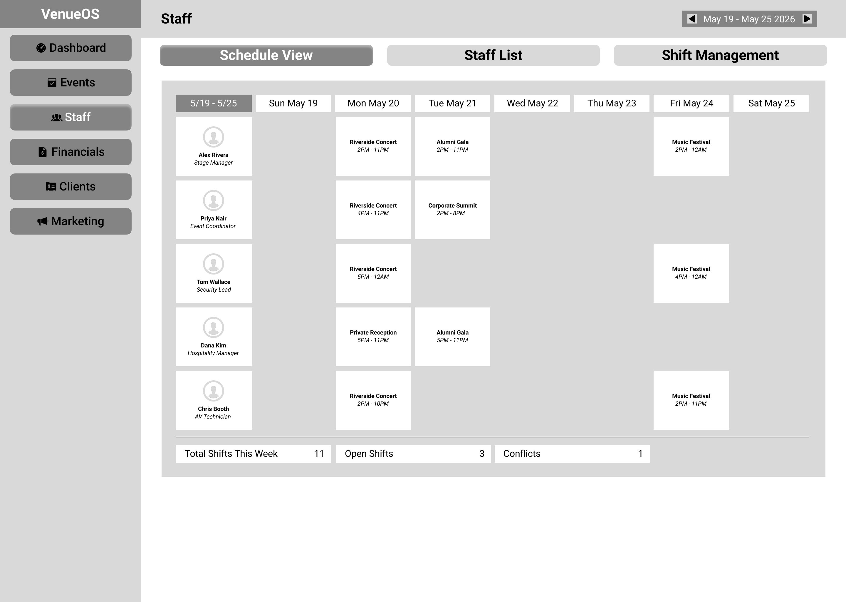
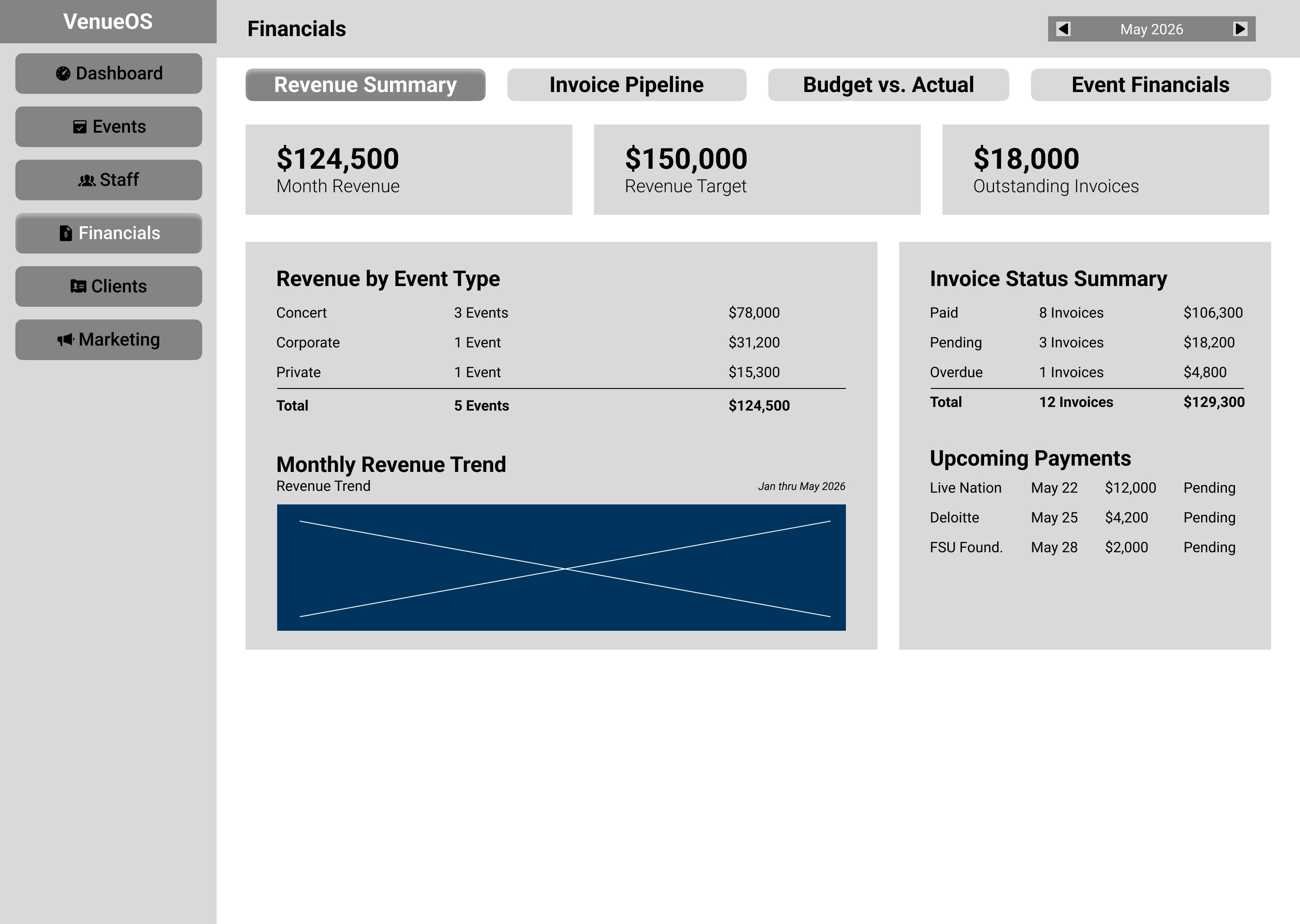
Five screens wireframed at 1440px desktop. These sit between lo-fi and mid-fi on purpose: past raw boxes, but deliberately short of visual design. The phase was not about exploration, it was about locking structure before any design decisions were made: component placement, column logic, content hierarchy, data relationships. Nothing moved to hi-fi until the layout under it was settled.
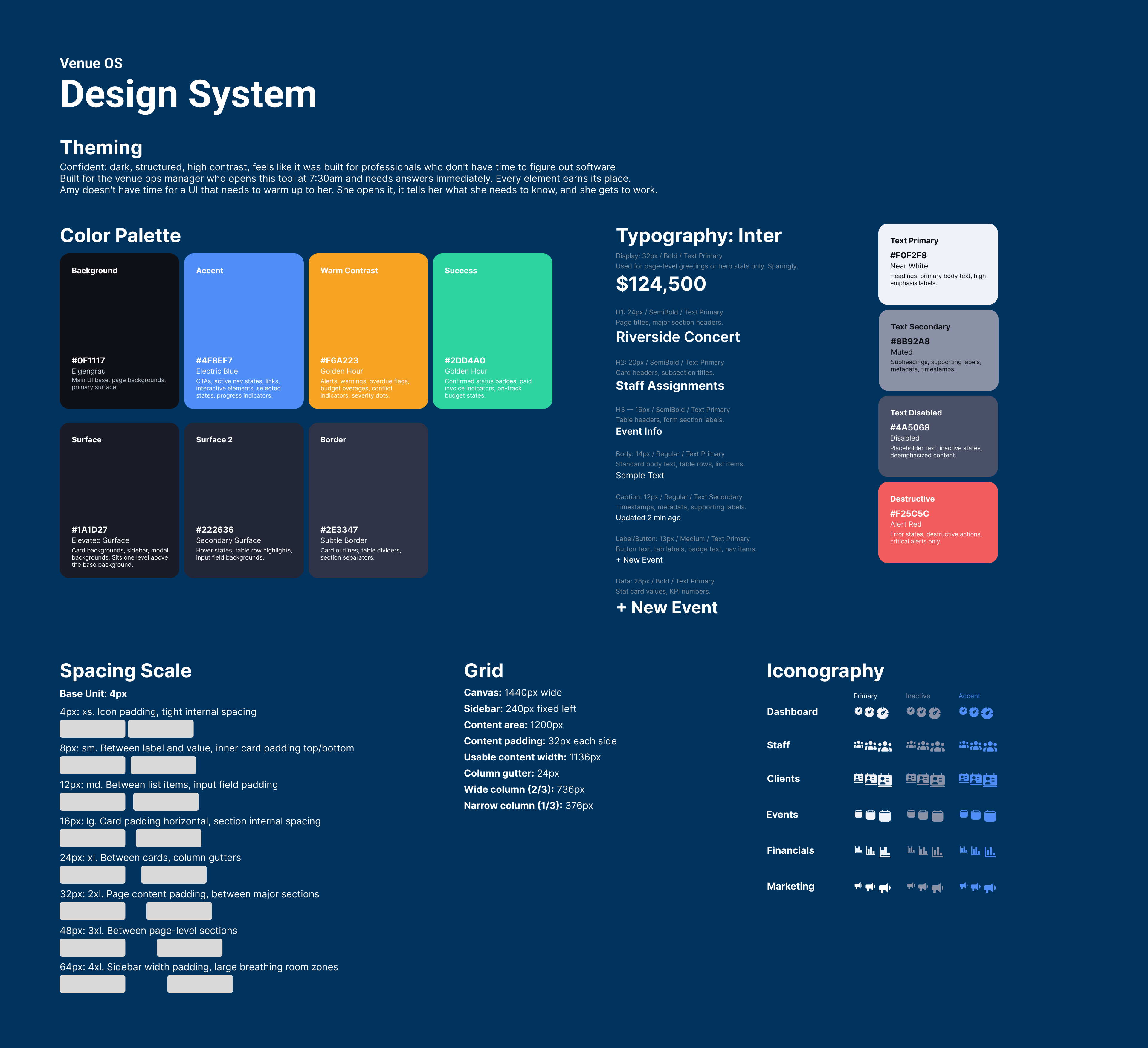
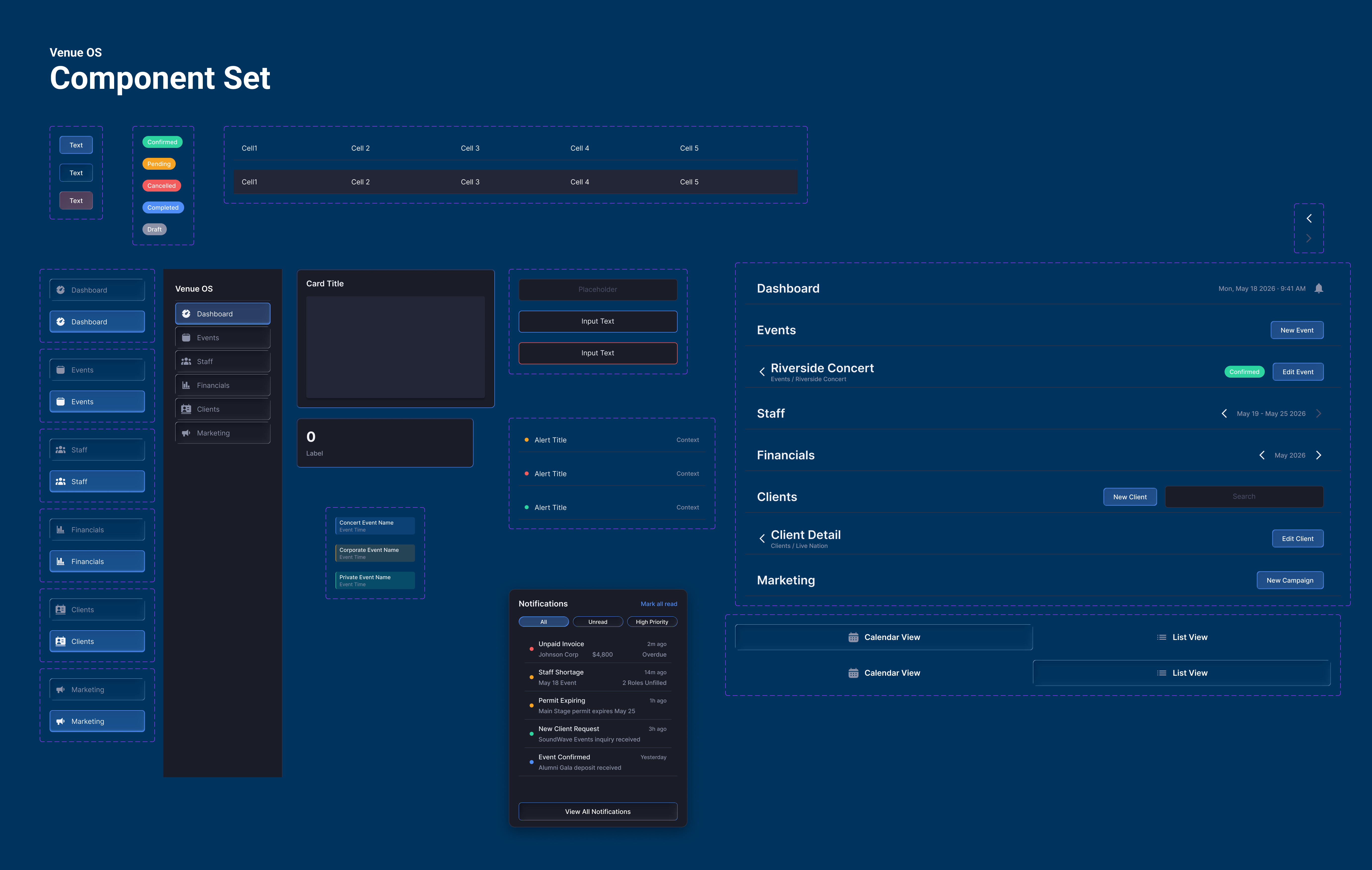
Visual direction: Confident. Dark, structured, high contrast. Built for the professional who does not have time to figure out their software. The system was completed before a single hi-fi screen was touched. Color tokens named with VOS prefixes and synced to a library. Eight component types with full variant sets. All auto layout.
This section is the argument the whole project is built to make: that the education I did on my own time, between jobs, became instinct I can act on. Every change below was pressure-tested against a principle, not a mood. Where a decision maps to something specific I learned, I name it. Where it was just the right call, I say so. What changed, why it changed, and why the result is better.
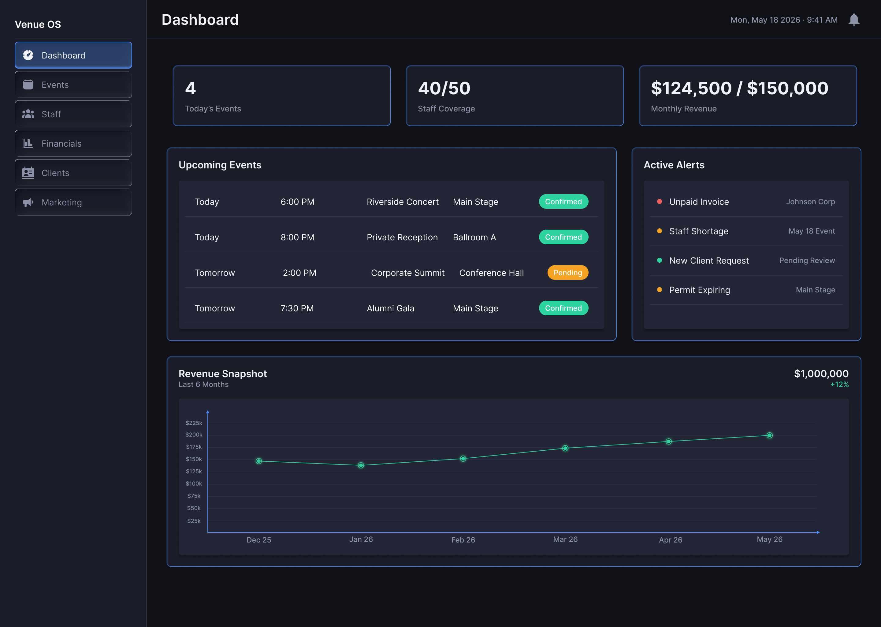
Changed: flat grid of same-weight tiles became a clear hierarchy. KPI values oversized, KPI tiles given an inner-stroke treatment to read as data containers, and the alerts list became a persistent severity-coded drawer instead of a right-column list.
Why: the lo-fi failed on contrast, the principle that primary content should carry the most visual weight. Everything read equally, so nothing led. An ops manager glances at this screen while doing something else, so the numbers had to be legible across a desk and the alerts had to be scannable without becoming a task.
Better because: Amy can now read coverage at a glance and catch a red alert in peripheral vision, which is the actual way the screen gets used.
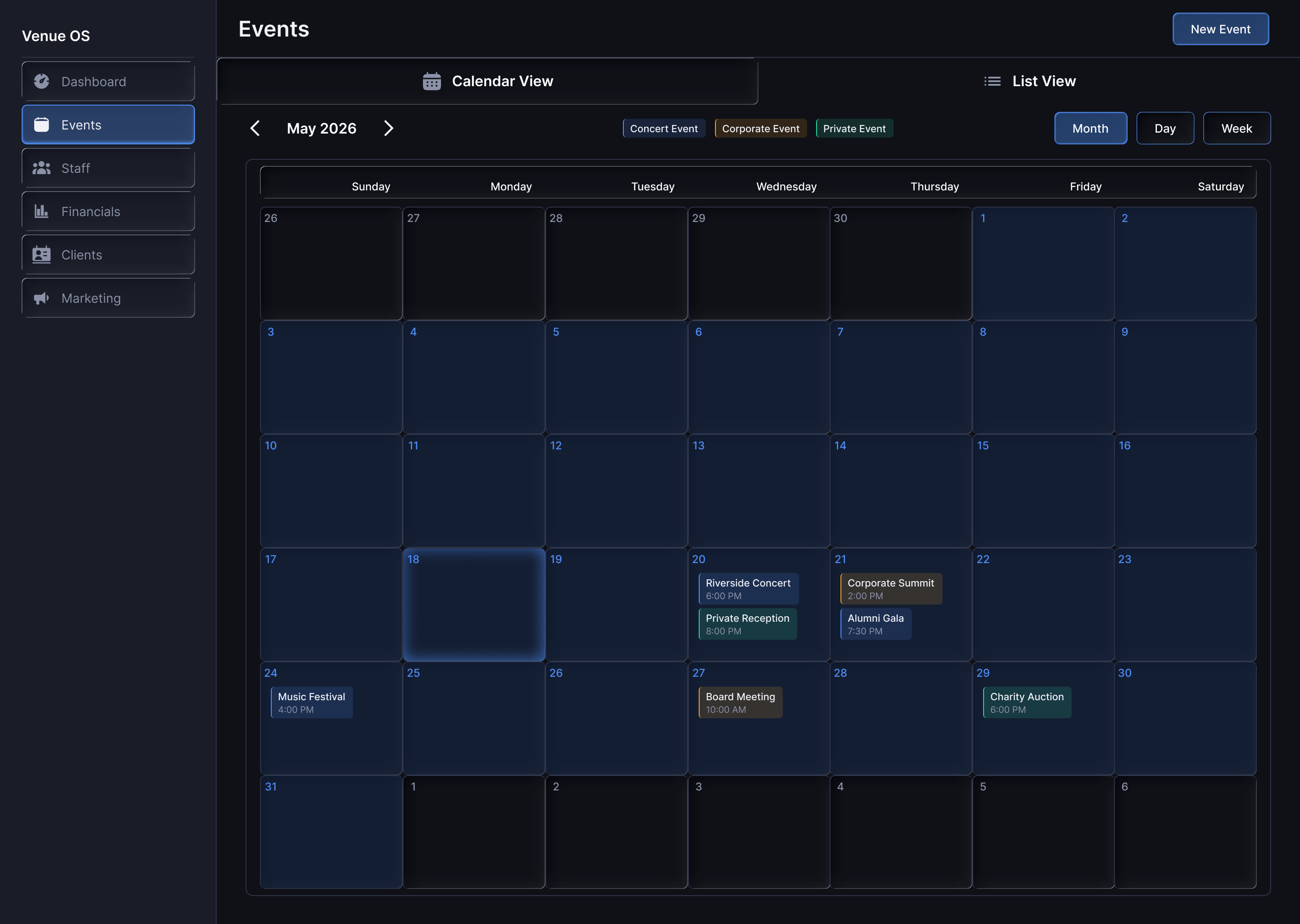
Changed: a monochrome calendar grid gained event-type color coding, an inline legend, and a dedicated Event Pill component with four color variants.
Why: this is contrast doing information work. Across 15 to 25 events a month, a single-color calendar tells you nothing about the shape of the month. Color lets you read the composition before you read a word. The coding wasn't in the lo-fi or the original component spec. It became obvious the moment the calendar held real data, so I built it in the hi-fi pass.
Better because: the month is legible at a glance instead of one event label at a time.
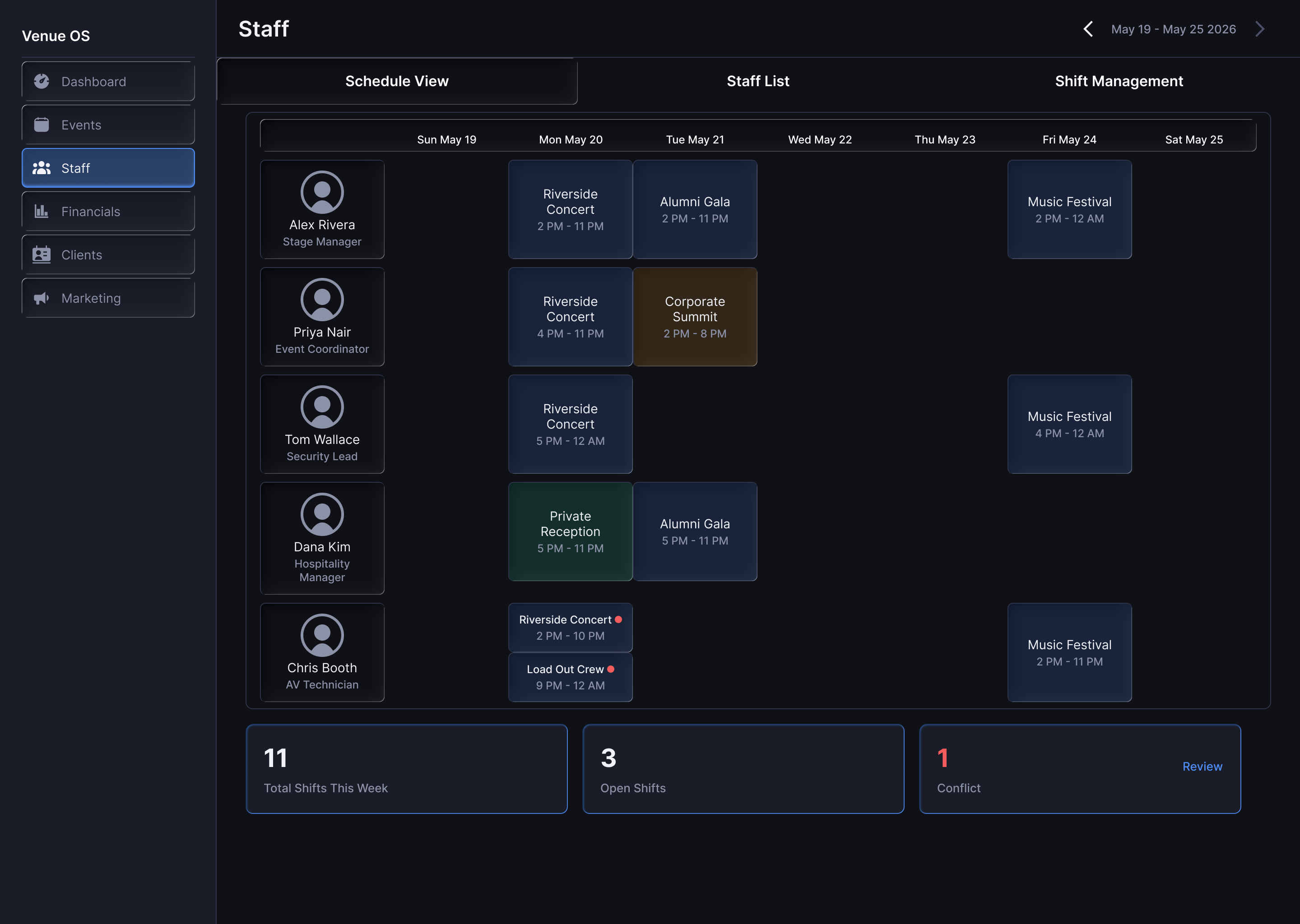
Changed: conflicts moved from the alert list onto the schedule grid itself, event-type color coding carried over from Events, and a summary stats row (Total Shifts, Open Shifts, Conflicts) was added at the bottom.
Why: a conflict should live where it happens, not in a notification you have to go find. That's proximity, keeping related information together. The color coding carried over because the same color has to mean the same thing everywhere, which is repetition doing consistency work, not decoration. The stats row exists because the manager's first question is "am I covered this week," not "who is assigned where."
Better because: Chris Booth's double-booking is visible in the grid before anyone goes looking for it, and coverage is answered before a single name is read.
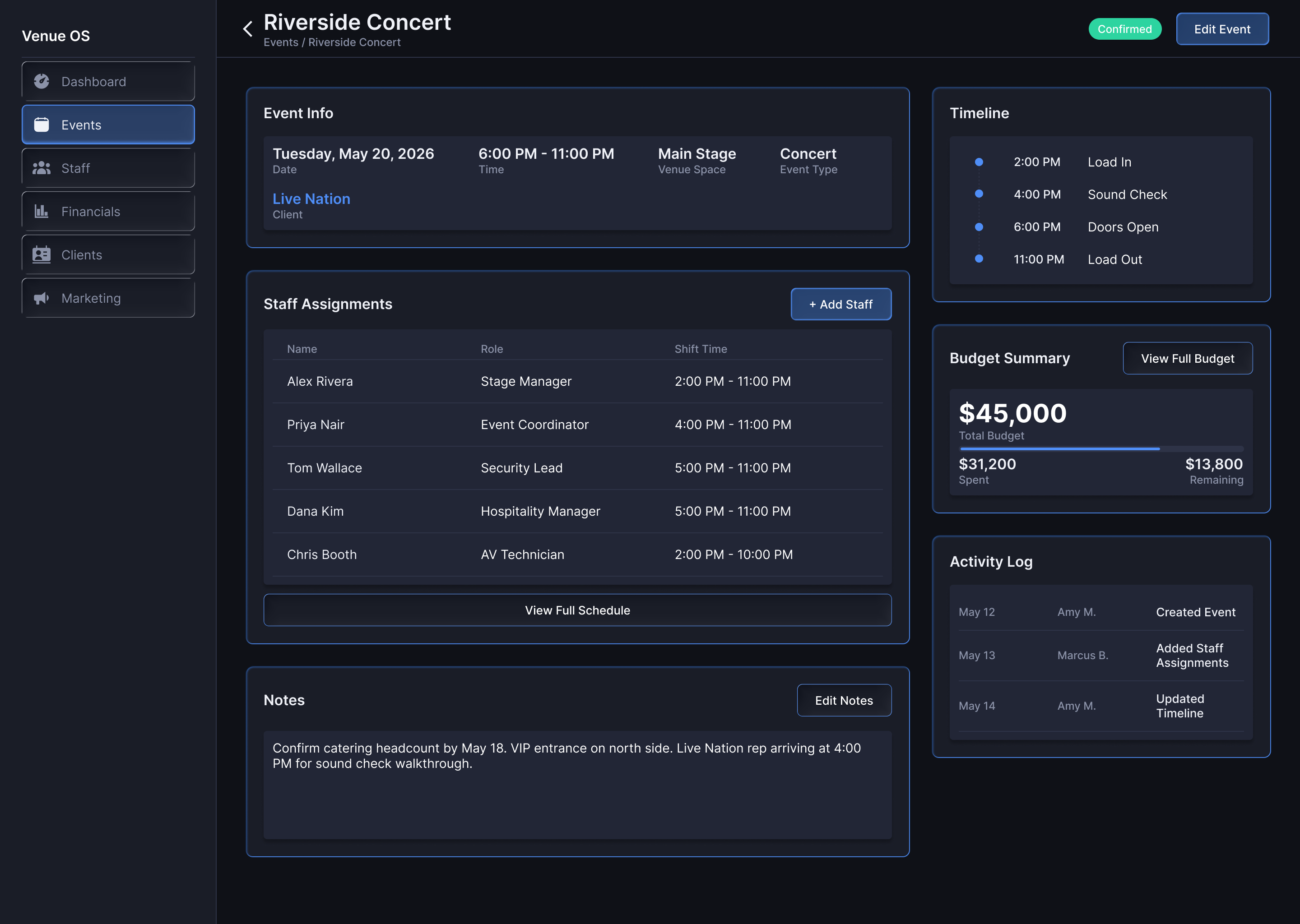
Changed: Staff Assignments and the timeline swapped columns, so Staff moved to the wide column. The budget section was rebuilt from a plain breakdown table into a progress bar against target with a projected-vs-actual split.
Why: the swap was a call I made mid-screen once real content was in, the kind of thing a wireframe can't tell you but populated data makes obvious. Staff data is wide (names, roles, times, status); a timeline reads vertically at any width. The budget change is progressive disclosure: Amy's first question is "am I on track," not "what are the line items." The bar answers the first question; the breakdown waits for the second.
Better because: the layout fits the data instead of fighting it, and the screen leads with the answer the manager actually needs first.
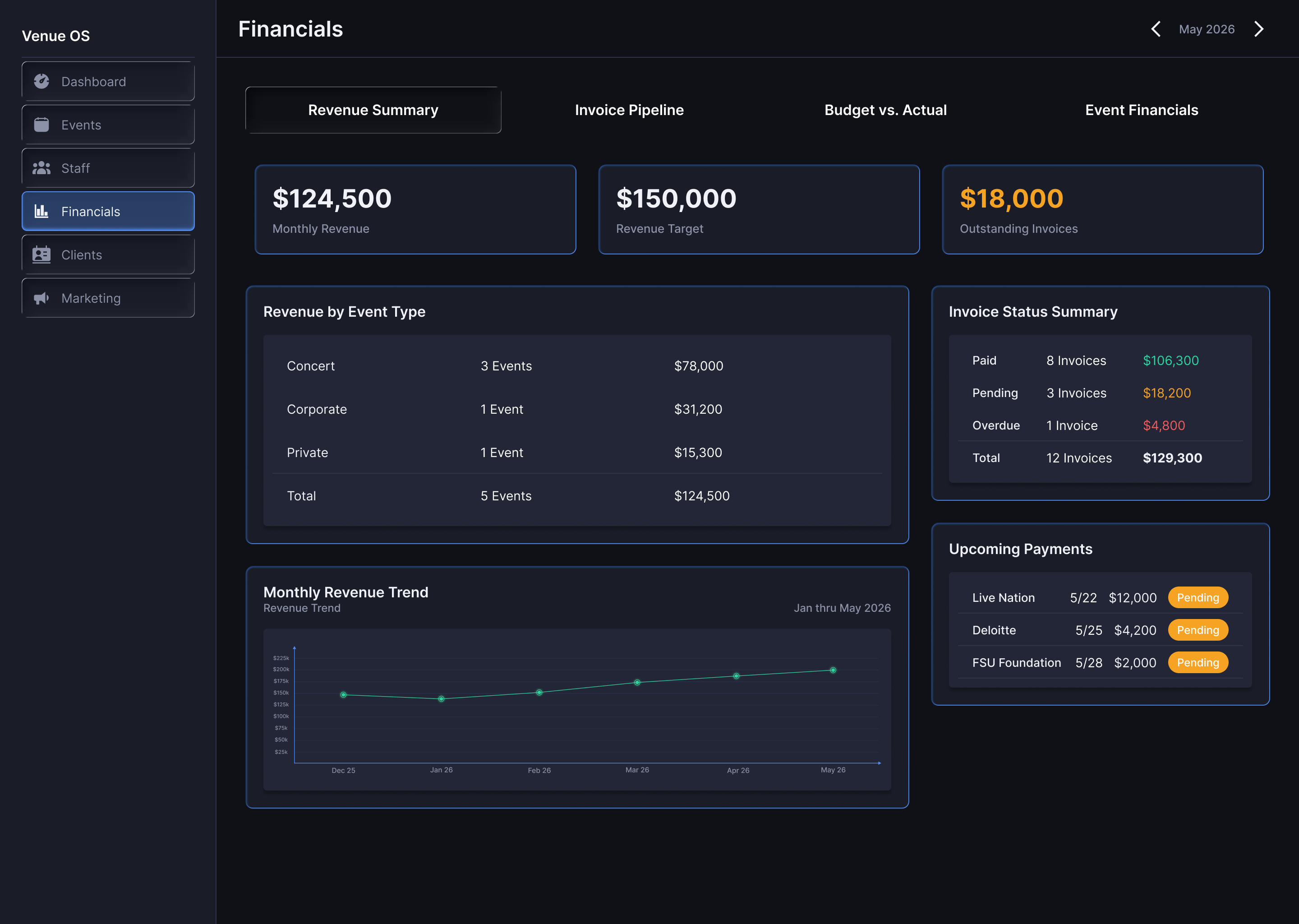
Changed: a hand-built 6-month revenue chart with a realistic seasonal curve, semantic color applied rigorously (green for revenue, red for overages and past-due, amber for pending), and glass sub-nav tabs for Overview and Invoices.
Why: financial data is where color semantics matter most, a neutral gray on "this invoice is 30 days past due" is a UX failure. The curve isn't arbitrary either; it climbs through winter into spring event season the way a real venue's revenue does, because false data teaches a reviewer nothing. Honest gap: invoice pipeline and budget-vs-actual are stubbed for a second pass, and I'd rather say that than fake it.
Better because: the number that needs action announces itself by color, and the screen reads like a real venue's books rather than a template.
Eight screens across six operational domains, plus a notification drawer state. All built on the design system, populated with consistent dummy data for Riverside Amphitheater. Swipe through, or click any screen to expand.
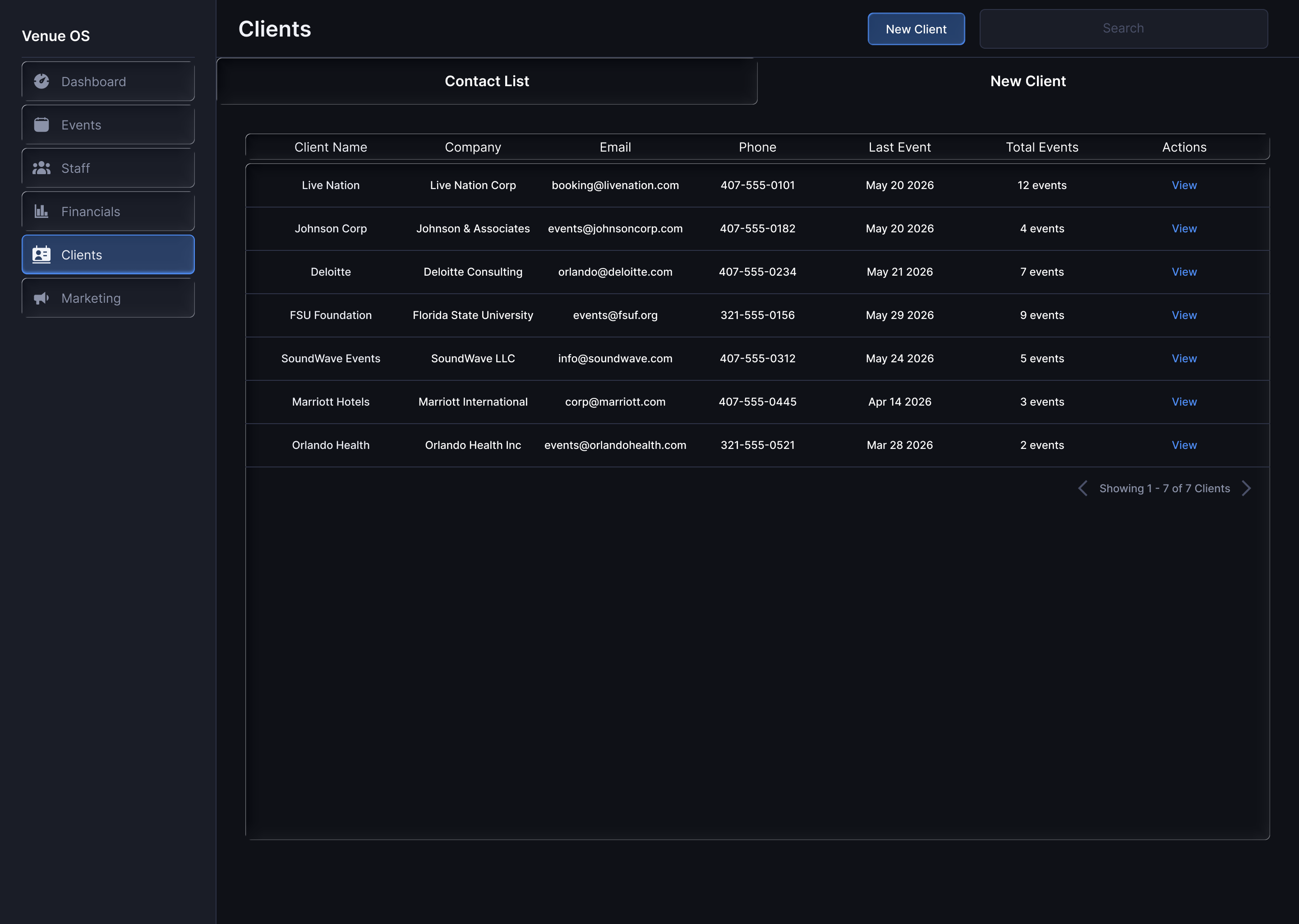
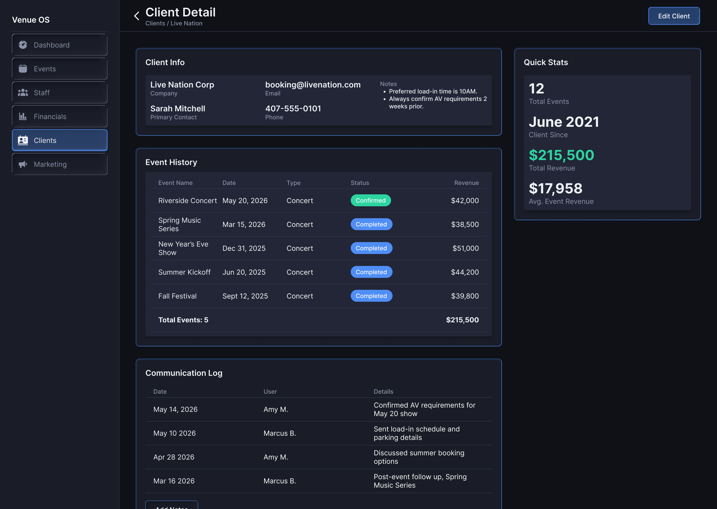
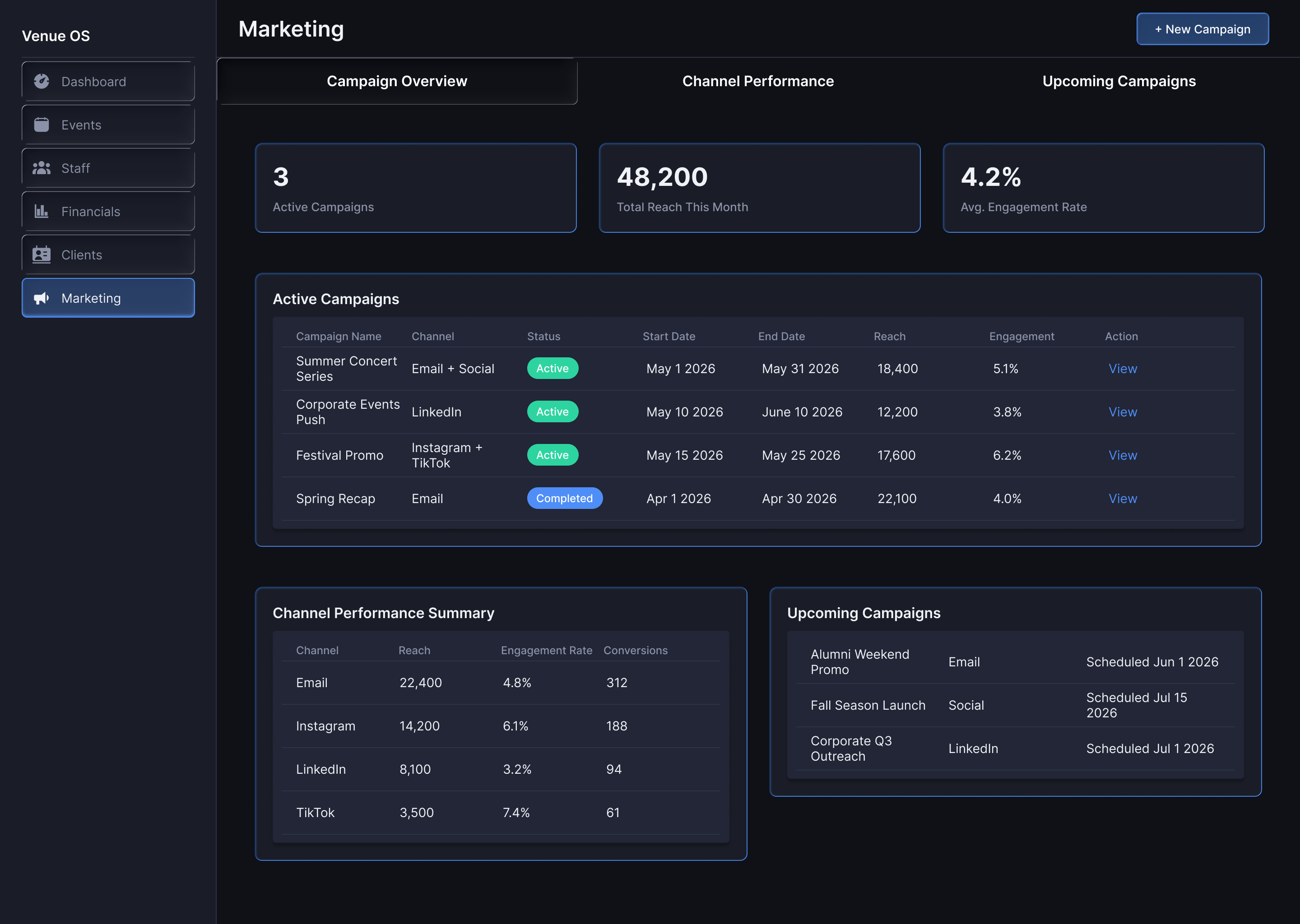
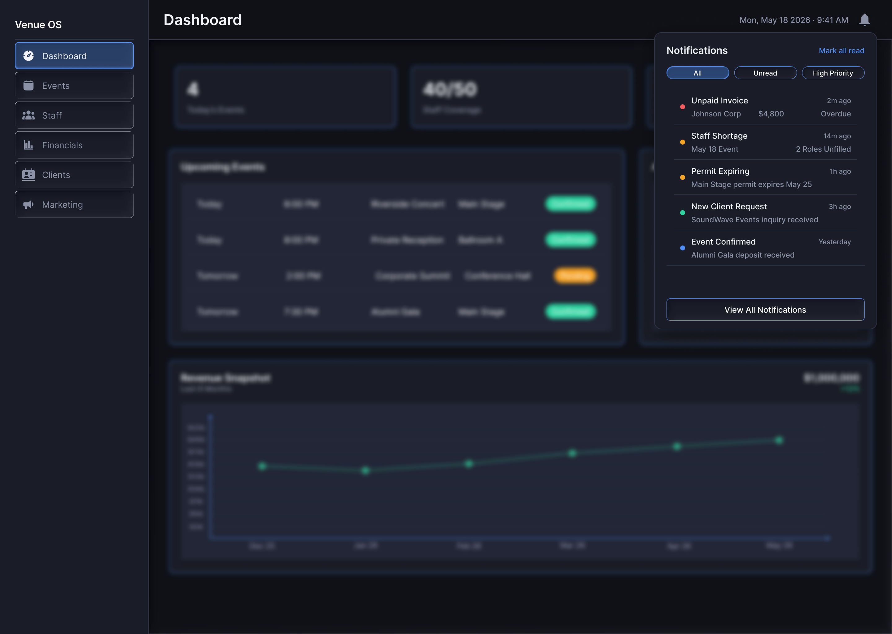
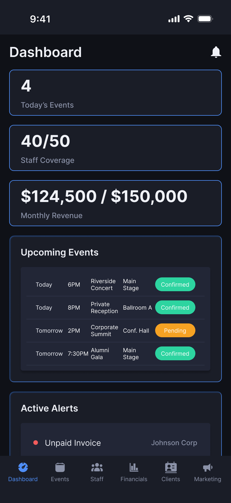
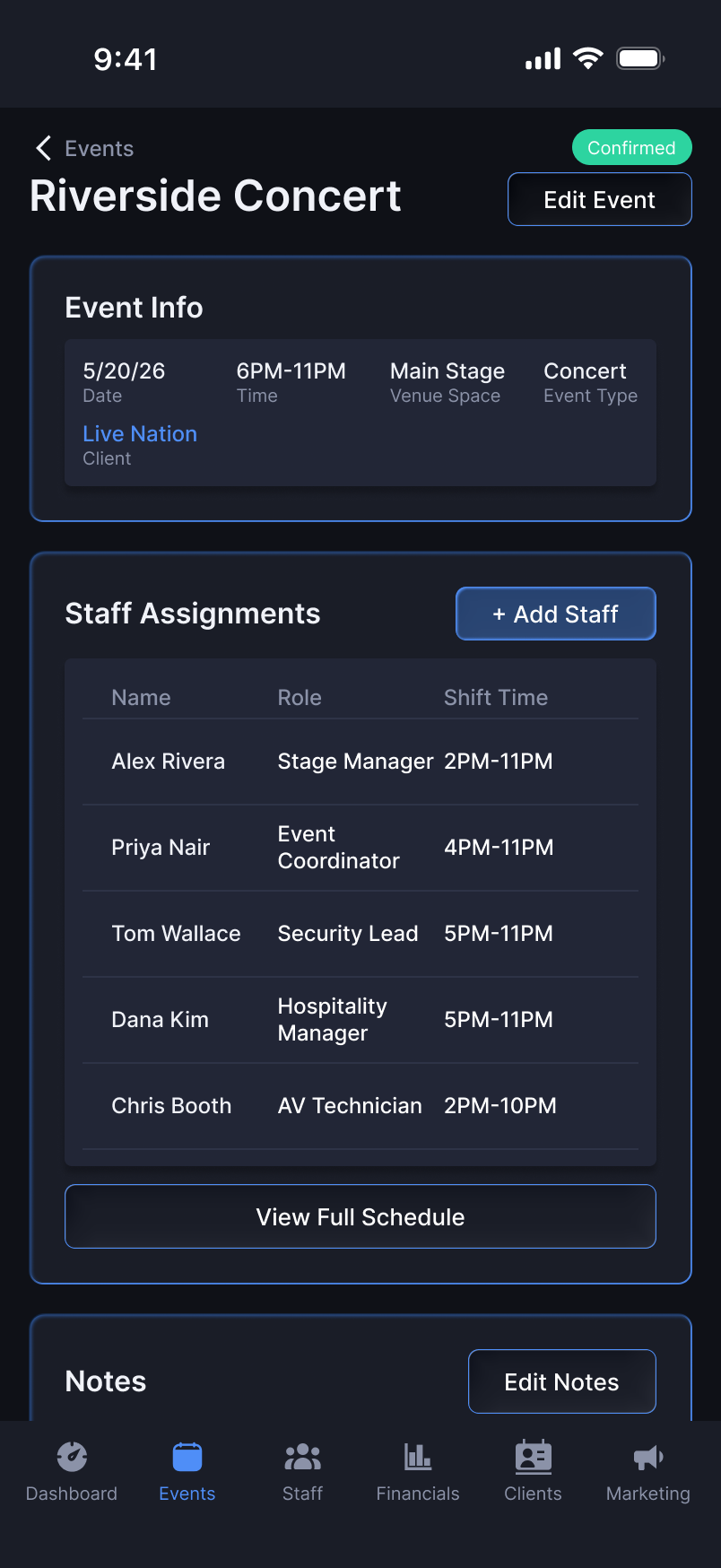
Venue OS is desktop-first, and that's the right call. The density it carries, staffing grids, financial charts, multi-column tables, collapses on a phone. But operations don't stop when the manager leaves her desk. On an event day she's walking the floor between the dock, the green room, and the stage, and the question the mobile screens answer is narrow: what does she need to check in the next sixty seconds?
The answer is today's status, current coverage, active alerts. Same data hierarchy as the desktop Dashboard, stripped to what requires a decision right now. It also doubles as a multiplatform proof: SOPO and ScreenPark were mobile-first consumer products, Venue OS is enterprise B2B, and designing the desktop system alongside its mobile companion shows the responsive approach scales across product types, not just screen sizes.
Venue OS exists to answer a question I kept getting asked, in one form or another, when I left SOPO: your experience is all consumer, all gaming and entertainment, can you design outside of it? I couldn't point to a contract that proved it, so I built the proof. Between jobs I put myself through formal UX coursework, and this project is where I applied the whole framework end to end, on my own, to find out whether it had actually become instinct. Strategy up through structure before touching a surface. Function-first IA. Contrast, proximity, and progressive disclosure driving the real decisions, not sprinkled on afterward. It held. The column swap on Event Detail, the color coding carried across screens, the budget bar over the line-item table, those weren't prompted. They were the framework acting on its own.
I want to be straight about one limit, because a good reviewer will find it if I'm not. I had no research budget and no users to test with. This was me practicing with what I had. So the decisions here were validated the honest way available to a solo exercise: pressure-tested against the principles above and against structured self-critique, not against real usability sessions. That's a real constraint, and naming it matters more to me than pretending the constraint wasn't there. A designer who can see the edge of their own evidence is more useful than one who claims certainty they didn't earn.
The other reason this project mattered: range. SOPO was consumer gaming. ScreenPark was consumer entertainment. Venue OS is neither. It's an enterprise B2B tool in a domain I'd never shipped in, and I picked mid-size on purpose, big enough to demand real systems thinking, small enough that I wasn't pretending to understand problems at a scale I've never touched. It moves me toward where I want to be without faking my way there.
Research through hi-fi, documented as if I were handing it to a development team tomorrow. That's the standard I hold myself to now, and I didn't need a new job to get there. I can act on it the day I'm hired.